Boosting traffic and revenue with a strategic redesign
Project Goals
- Create a new blog design from scratch. The aim was to improve the overall user experience, boost page traffic, and increase the time users spend on pages.Redesign the existing vehicle finder to improve the user experience and user flow.Increase user interaction with ads to boost monetization.

Understanding
the marketTo ensure CarsGenius remained competitive in the automotive market, I conducted an in-depth analysis of industry leaders such as MotorTrend, Auto Trader, and Car Gurus. I was familiar with these competitors previously, so I knew right away they would be good to compare. Auto Trader is a great inspiration for the vehicle finder, as it provides a similar flow, while something like MotorTrend is your typical auto blog. Overall this research provided invaluable insights into current design trends, user expectations, and effective monetization strategies.
Understanding
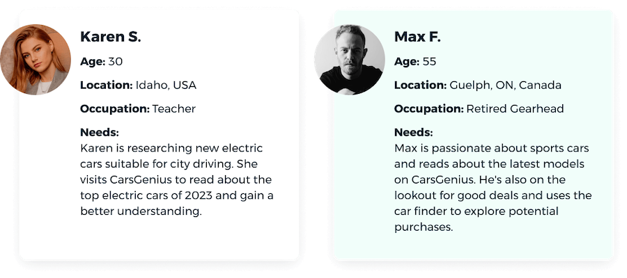
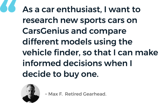
our usersInitial data from the previous website showed that the majority of our users are 30-50 years old, and 90% of the traffic is mobile based. This would influence the design direction, such as prioritizing a mobile friendly website, and various accessibility decisions. I then created straightforward user personas and a user story to grasp who would utilize CarsGenius and for what purposes.
Collaboration
Throughout the project, I worked closely with project managers, developers, and stakeholders to keep everyone on the same page. I used user testing and team feedback to tweak the designs and ensure we met our goals.
I also regularly updated senior leadership on my progess, showing how my design choices supported business objectives and user needs. I used metrics and feedback to highlight the impact of my changes and adjusted the design accordingly.
Developing User Flows
With the user personas as a guide, I decided to start developing some user flows. This would give stakeholders and myself a basic idea of how users would get from point a to point b. On the auto blog, the business goal is for users to reach an article page and go through an advertising funnel. The flow of the vehicle finder would stay the same as the previous design, so new flows wouldn't need to be developed.

Framing the Layout
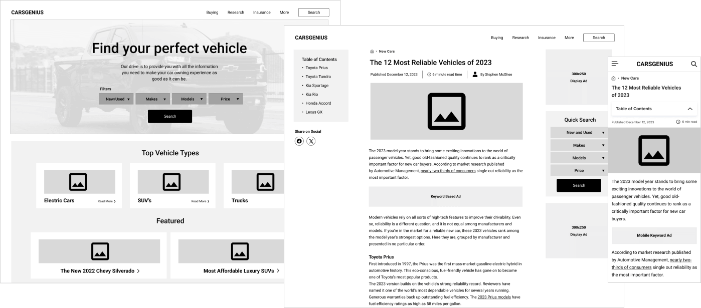
While the vehicle finder already had a layout previously created, we didn't know exactly what we wanted to show on the auto blog. I felt it would be a good idea to create some wireframes to help visualize what elements we wanted on each page. I had a rough idea of where I wanted to place advertisements based on the data from previous websites I've worked on, but it would still require testing in later stages. I then brainstormed some new ideas and created over 20 lo-fidelity wireframes.
Creative Inspiration
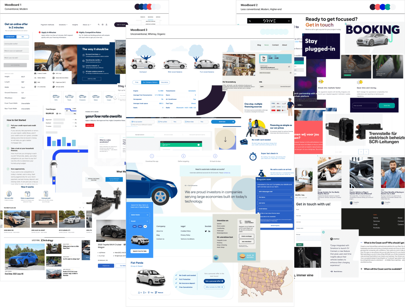
In order to get a basic idea of how the redesign should look visually, I like to create a few moodboards showcasing a few different styles. I spent some time on the previous competitors websites, as well as non-related websites to gather inspiration. From those, I put together 3 distinct looks: one conventional, one modern and high-end, and another that was unconventional, whimsical, and organic.
Early Testing
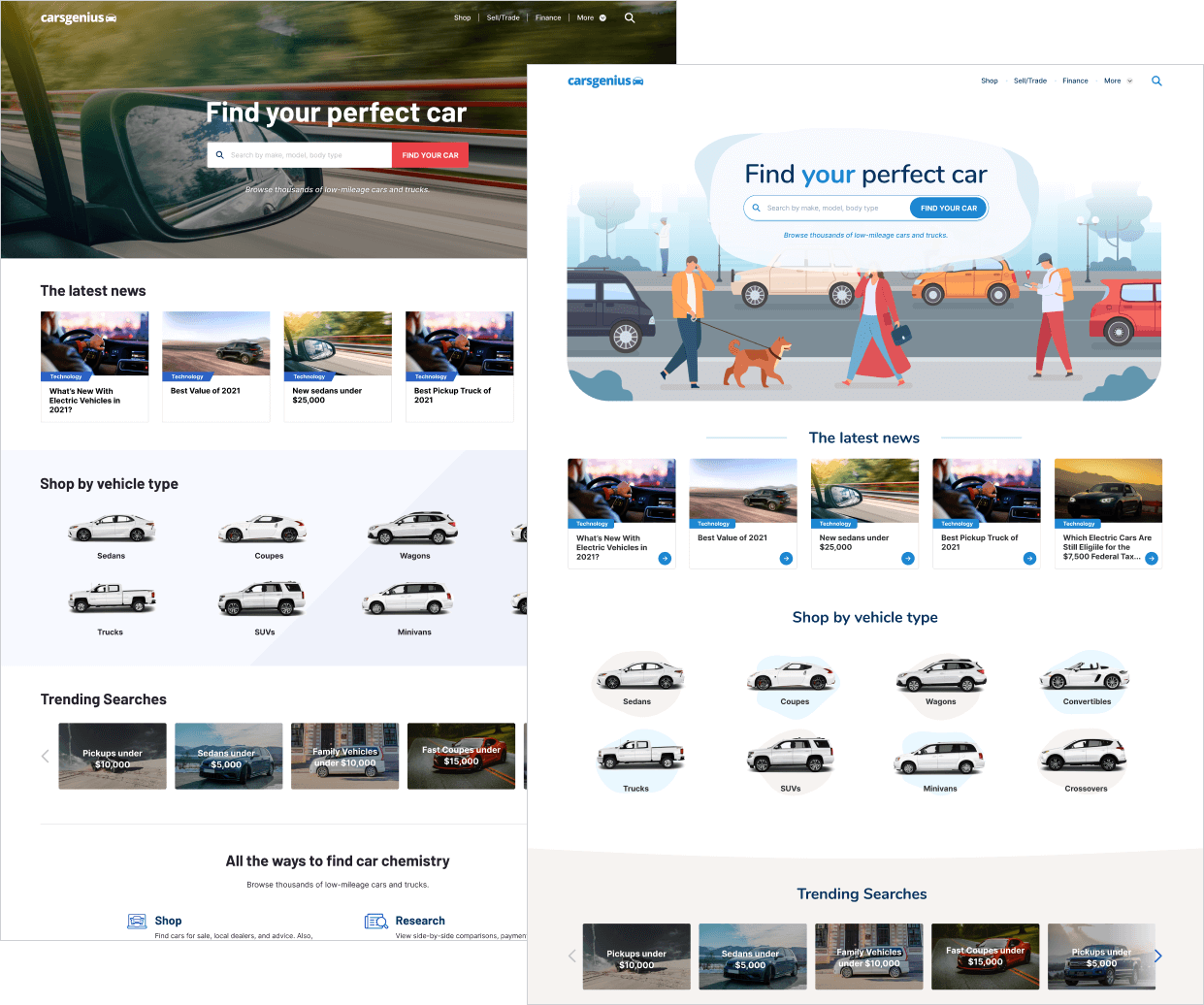
After consulting with stakeholders, we narrowed down the themes to two preferred options. I created 2 early design variations, and then conducted quick tests with 10 users to determine their preferences. 7 out of 10 users showed a strong preference towards a design that was modern, playful, and organic. This design direction deviated from conventional norms within the auto vertical, making it a distinctive project to work on.
Building a Design System
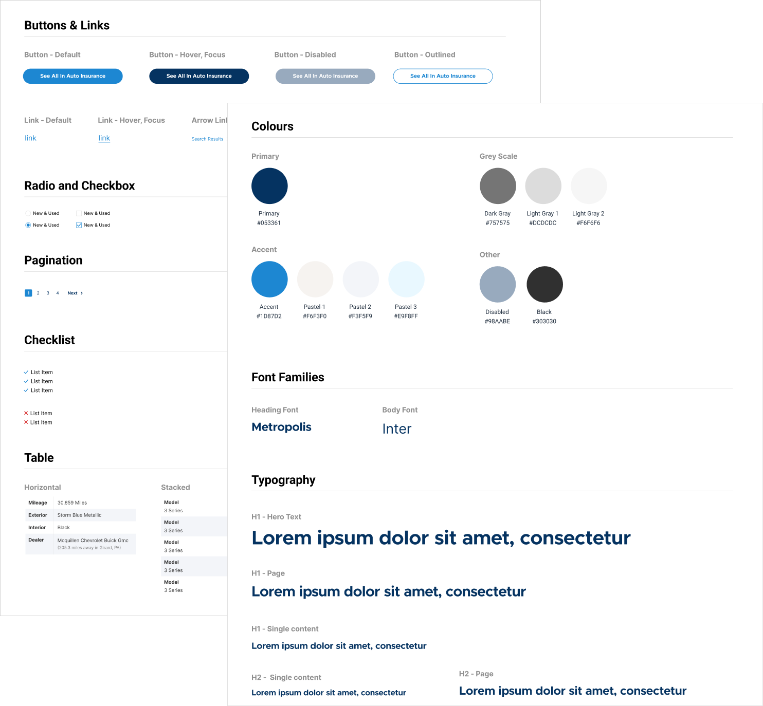
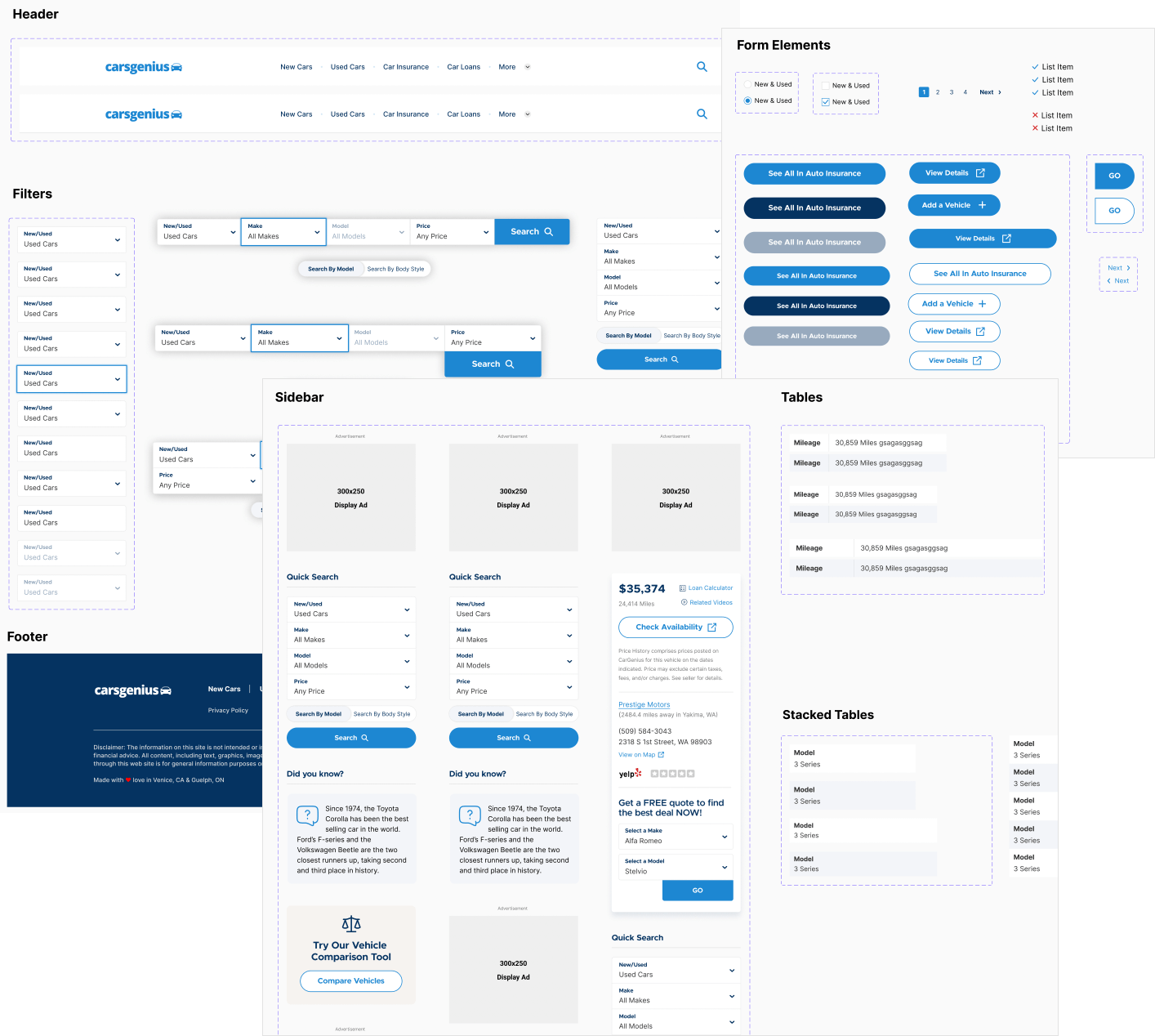
As the dedicated designer overseeing CarsGenius, I developed a scalable design system and style guide that not only ensured visual consistency but also enabled future expansion, allowing for smooth integration of new features and advertising formats. This would serve as a guide for both myself and developers who work on the website going forward. Figma's component variations and variables were utilized to make reusability easy across the project.
Visual Design
Drawing insights from the moodboards and testing conducted, I designed the UI with a combination of modern typography, bold colors and organic shapes. In all, I ended up designing over 40 mockups during this phase, with several iterations along the way. I held weekly design reviews with stakeholders to ensure all feedback was addressed.
All font choices and color combinations underwent testing to ensure compliance with WCAG AA guidelines.
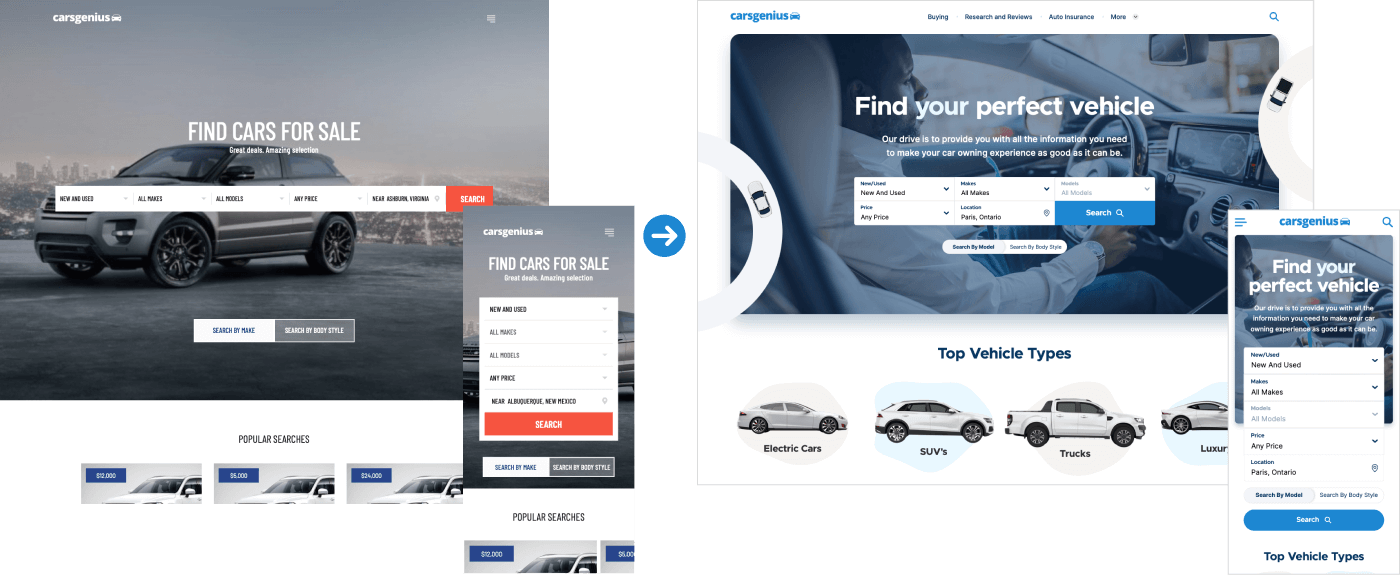
CarsGenius homepage - before and after The article page on CarsGenius is the most critical component because of the traffic and advertising it receives. A great emphasis was placed on presenting a clean and uncluttered layout.
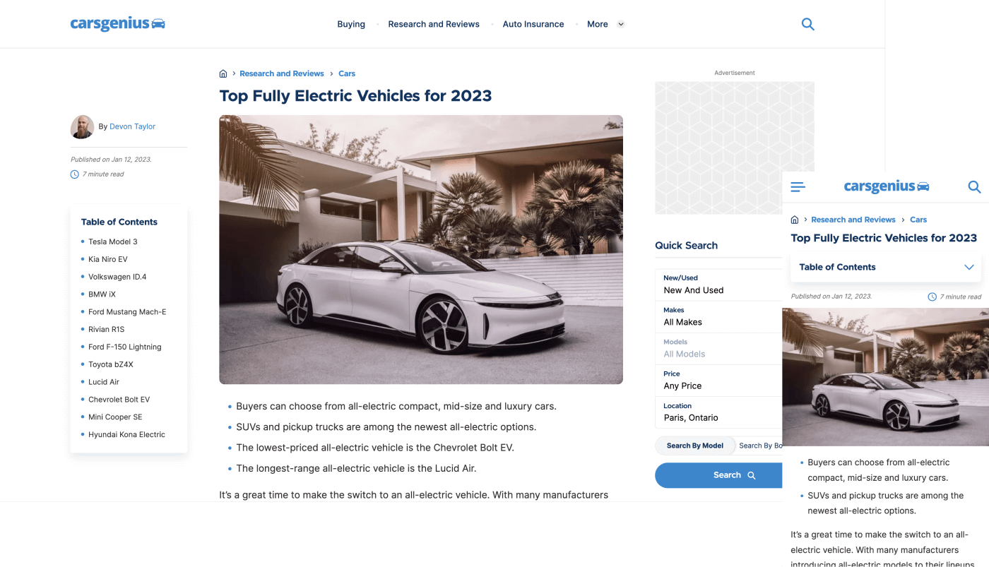
In order to improve the click through rate for ads, I made sure to place the most important advertising above the fold, which ensured users would see it straight away. There would always be a display ad in the sidebar, as well as some Google ads within the content. Hiding or repositioning ads to different locations was possible using internal tools to modify the templates. For example, ads could be moved below the header, title, sidebar, or below a specific paragraph in the content area. These all provided different results in terms of click-through rate.
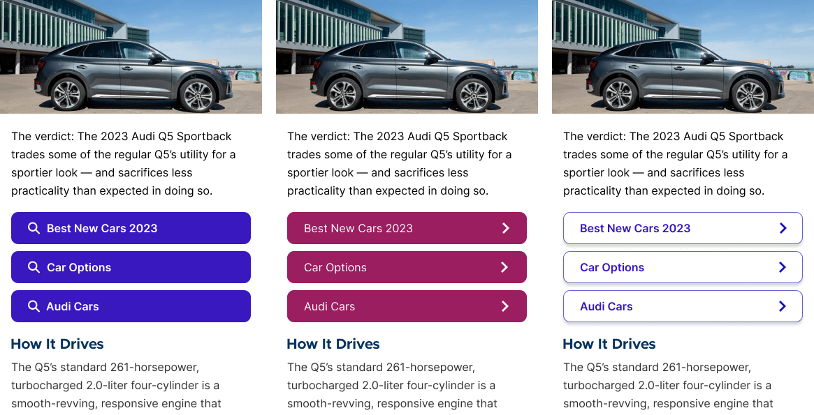
For any keyword based ads (Google/Yahoo), I could control certain aspects of the styling such as typography, colors and iconography. It was crucial that all ads met Google's strict compliance standards, which I closely followed. Alot of testing was done with these ads in order to maximize CTR - the slightest tweak in design can greatly affect click-through rates. We also experimented with other advertiser tools like Bing and Taboola, which could be placed at the bottom of the content area, or on the 2nd step of the advertising funnel. After experimenting with ad placement and styling, I found solutions that improved click-through rates ranging from 8% - 10%!
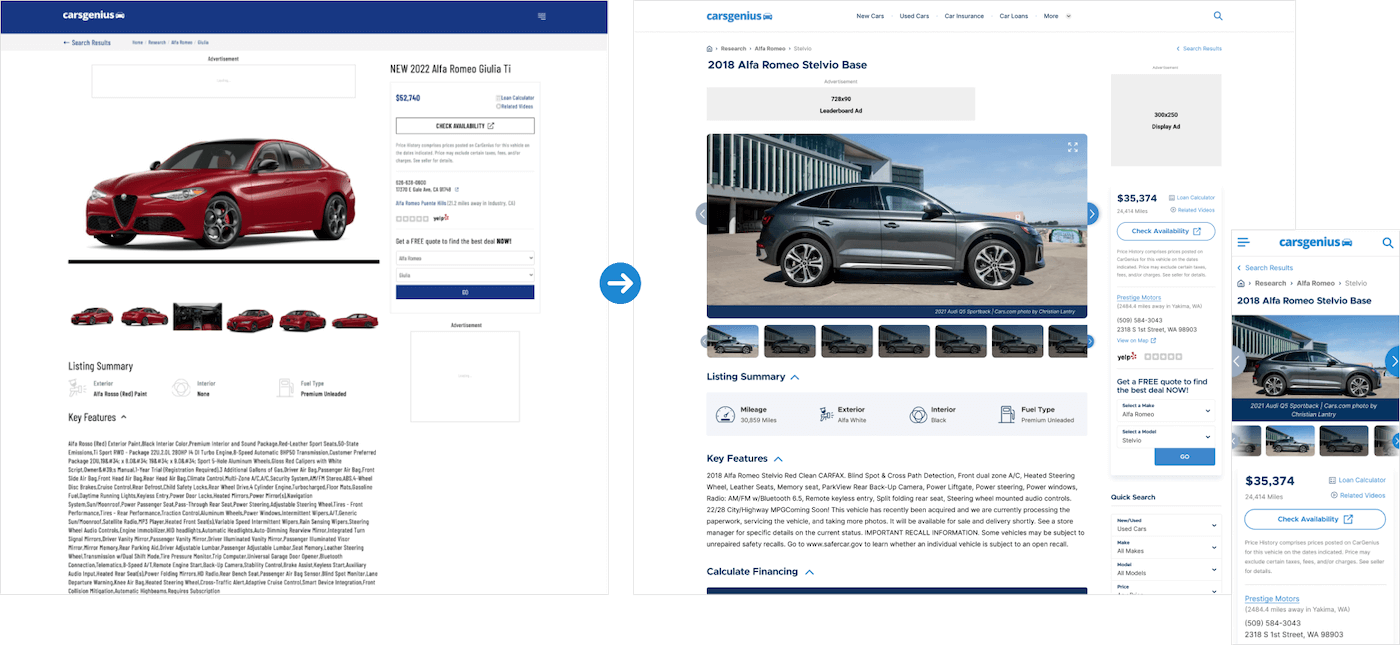
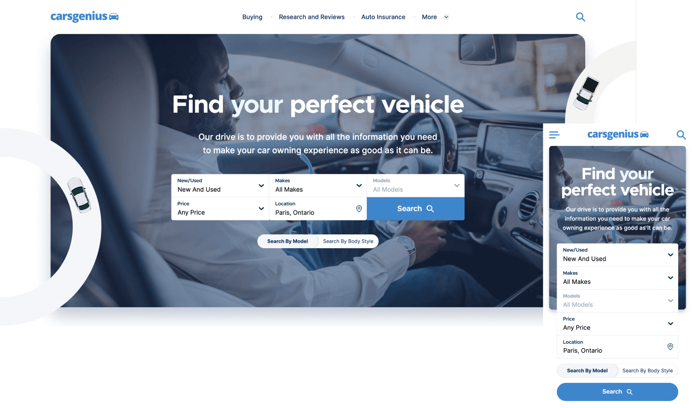
The vehicle finders product detail page - before and after The vehicle finder was updated to align with the new design system. It also had some minor layout changes to match the auto blogs design, such as a new navigation, adjusted heading positions, and new quick search features. These changes were tested, and all contributed to an improved user experience.
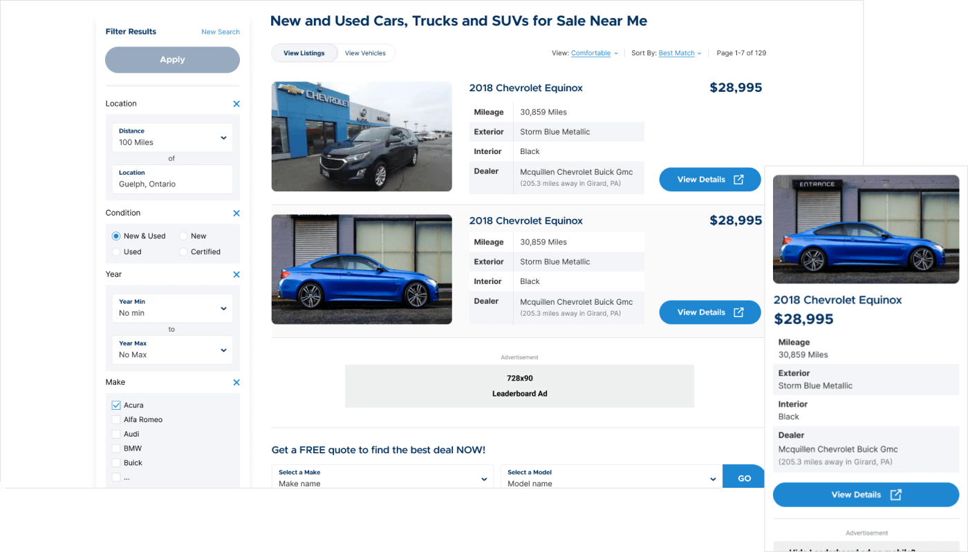
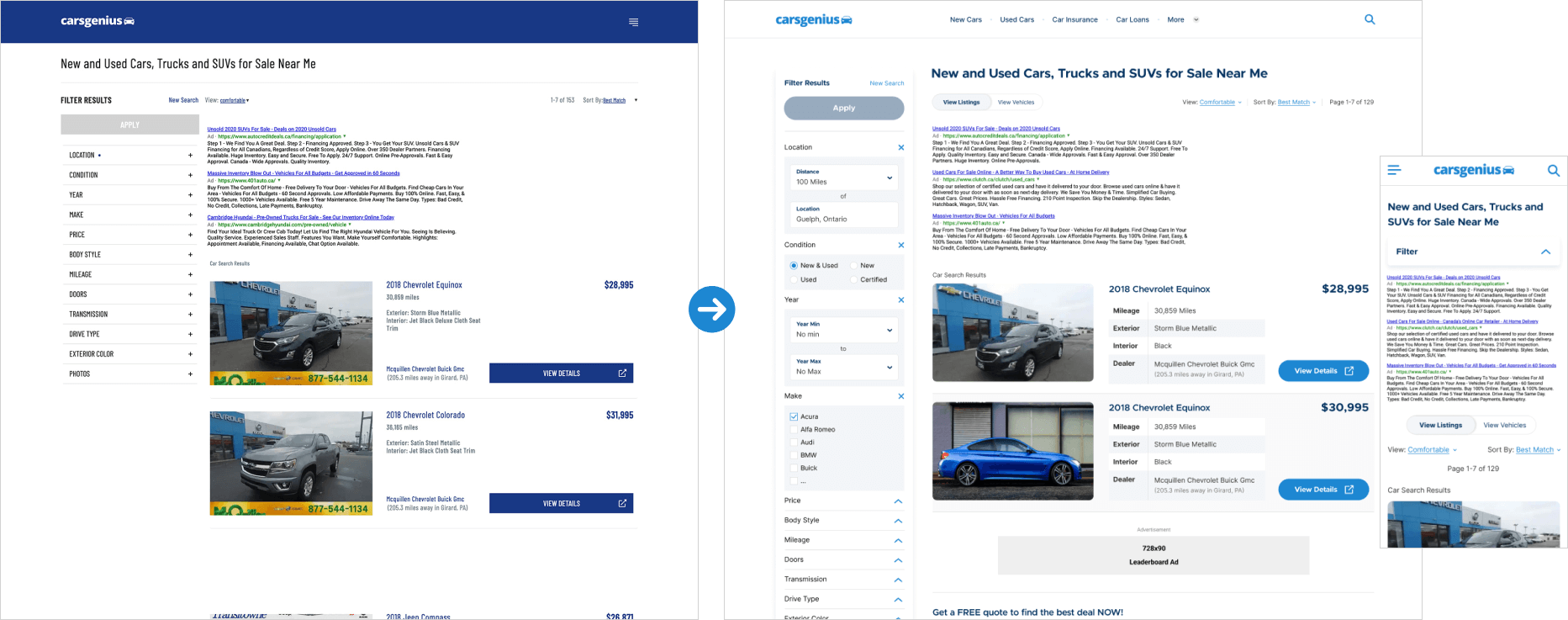
The vehicle finders listing page - before and after 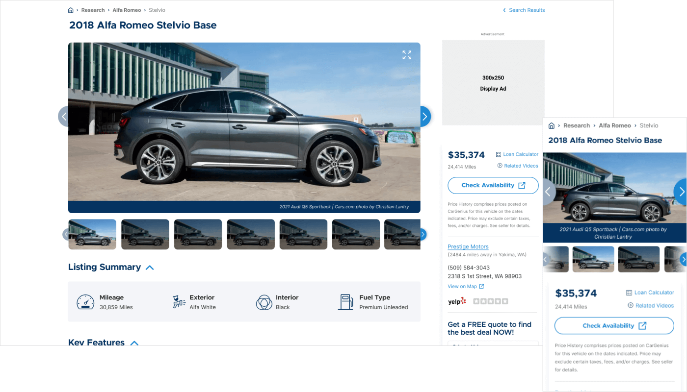
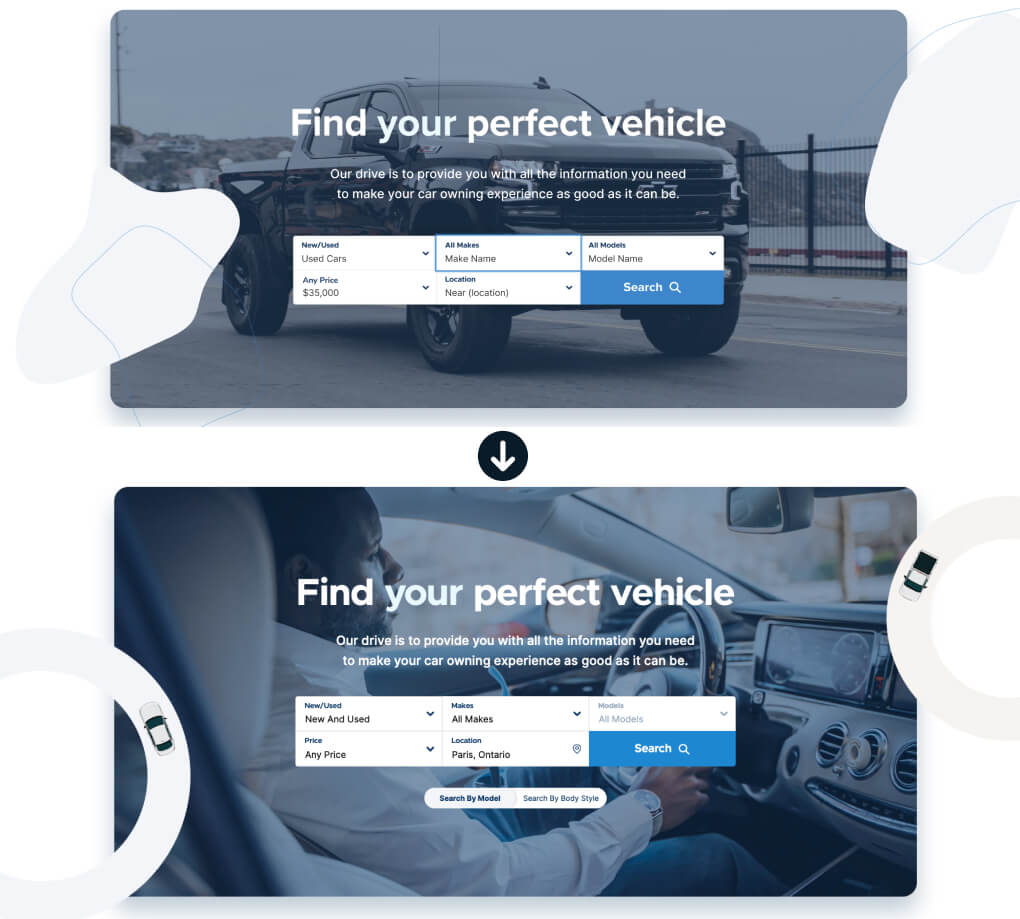
An early design which experiments with different visual elements 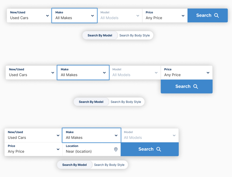
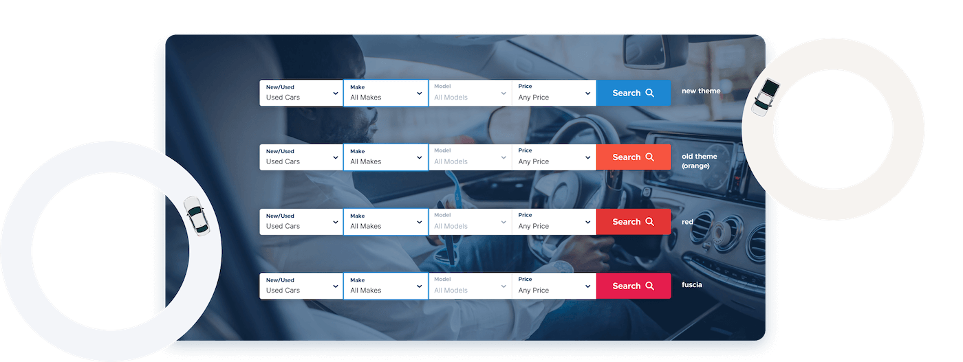
The vehicle finder search form at different breakpoints Below is an example of a design tested in order to perform better with our users. A simple colour change to the vehicle finders search button improved click-through-rates by 5% (Based on 5000+ users over 2-3 days on mobile and desktop devices).
Build Phase
Instead of a standard Figma prototype, and for deadline reasons, I provided support to the development team by transforming my mockups into an optimized WordPress theme. My responsibilities encompassed constructing the HTML, SCSS, and any interactions with JavaScript. To ensure consistency and adherence to best practices, I created a set of markup and CSS guidelines that served as a reference for every developer involved.
Accessibility was a core consideration throughout the development process. I incorporated accessible markup, accommodating features such as keyboard focus support, compatibility with screen readers, and color contrast tests.
The outcome
- After launch, users reported greater satisfaction with the blog's design and usability, leading to lower bounce rates and session lengths increasing by up to 2 minutes (from a 30 second to 1 minute average).
- CarsGenius gained significant traffic (1.2 million monthly visits via paid and organic traffic!), with users actively engaging articles and the advertising throughout.
- Optimizing the design of the article page and its ads resulted in a 8% - 10% increase in click-through rates, and reduced page load times.
- The vehicle finder redesign has not yet launched due to other priorities within the company.
Learnings
- Always share new design updates with your team and senior stakeholders. Getting feedback from everyone helps keep the project on track with business goals.
- Ads were a key focus for this project, but the user experience was just as important. At times, the push for more ad placements could have made the site feel cluttered. However, by prioritizing smart ad placement and design, I found solutions that boosted performance without hurting the site's usability.
- Data is everything. It helped me understand our users and predict if a design or component would work.
- Make it a habit to review the developer's code and final output. Sometimes the end result didn't match my designs, so I made sure to give feedback during meetings and on GitHub.
Get in touch
Let's Start Something
