From Concept to Reality
Identifying the challenges
Whenever I begin a new project, I always think about what I want to achieve and what might get in the way. Here were some of the challenges and goals for the portal.
- Bring together style guides, brand info & resources from 20+ properties into one easy-to-access hub.
- Most of System1's brands lacked design systems, having only style guides. I would need to develop individual design systems for each brand.
- Designs are inconsistent and development times inefficient. Align designers and developers with a shared understanding of design standards.

Understanding
the market
I conducted an analysis of competitor design systems, including the Atlassian Design System, Shopify Polaris Design System and IBM Carbon Design System. These analyses provided inspiration and insights into the key components necessary for an effective design system.
These competitors only need to focus on single-brand design systems, whereas this portal would need to accomodate multiple brands. There were alot of questions I would need to solve myself.
Understanding
our users &
their needs
I crafted straightforward user personas and a user story to grasp who would utilize the design portal and for what purposes. The majority of the user base is internal, but external users could also visit the site to get insight on System1 brands.


Cross-functional partnership
I organized meetings with stakeholders to gather their perspectives, insights, and resources. Most designers on my team were already familiar with design systems and had basic style guides and components set up in Figma. This was a good foundation for developing more comprehensive design systems.
However, engineers, project managers, and the editorial team were not familiar with design systems. I took the initiative to explain what design systems are, their benefits, and encouraged their participation in contributing to the design portal. The goal was to empower teams to manage their own brands and make design systems a regular part of their workflows.


The portal would serve as a source of truth for all designs, so anytime a designer/developer made an update within Figma/Code, I would bring over the change into the portal.
I served as the main point of contact for any questions related to design systems, continually maintaining and championing the portal. This approach ensured a consistent and efficient design process across all teams.
Design System Thinking
It was an important part of my role to help everyone think in terms of design systems, and educate whenever possible. Some areas included:
- Naming files, layers and components
- Using Figma variants
- Using design tokens
- Building a component
- Ensuring consistency
- Version Control
- Collaboration Tools
- Accessibility Standards
- Design System Governance
- Component Testing
- Change Management
- Metrics and Analytics
The structure
A sitemap was developed to visualize the hierarchical organization of website content and navigation paths. With 22 different brands, there were going to be alot of pages needed in this portal! Many of the brands shared similar templates, but could be customized further if needed.

Layout Design
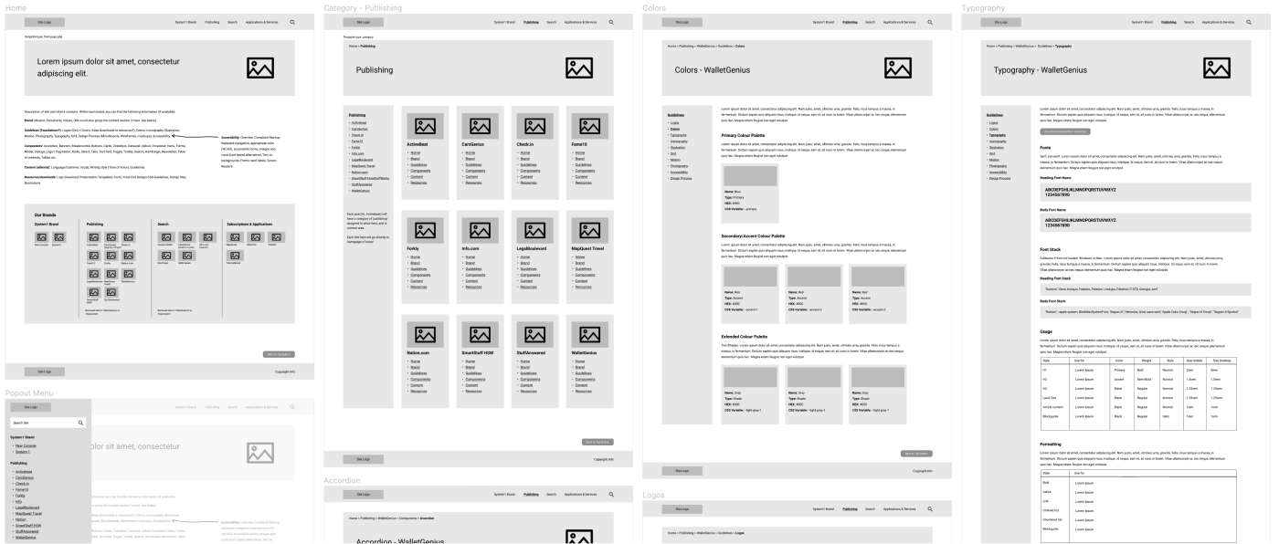
I wasn't sure exactly how I wanted to layout the design systems within the portal, so I started with wireframes to help visualize and plan the structure. The navigation was an important area to consider, as I wanted employees to be able to access resources quickly and easily.
Visual Design
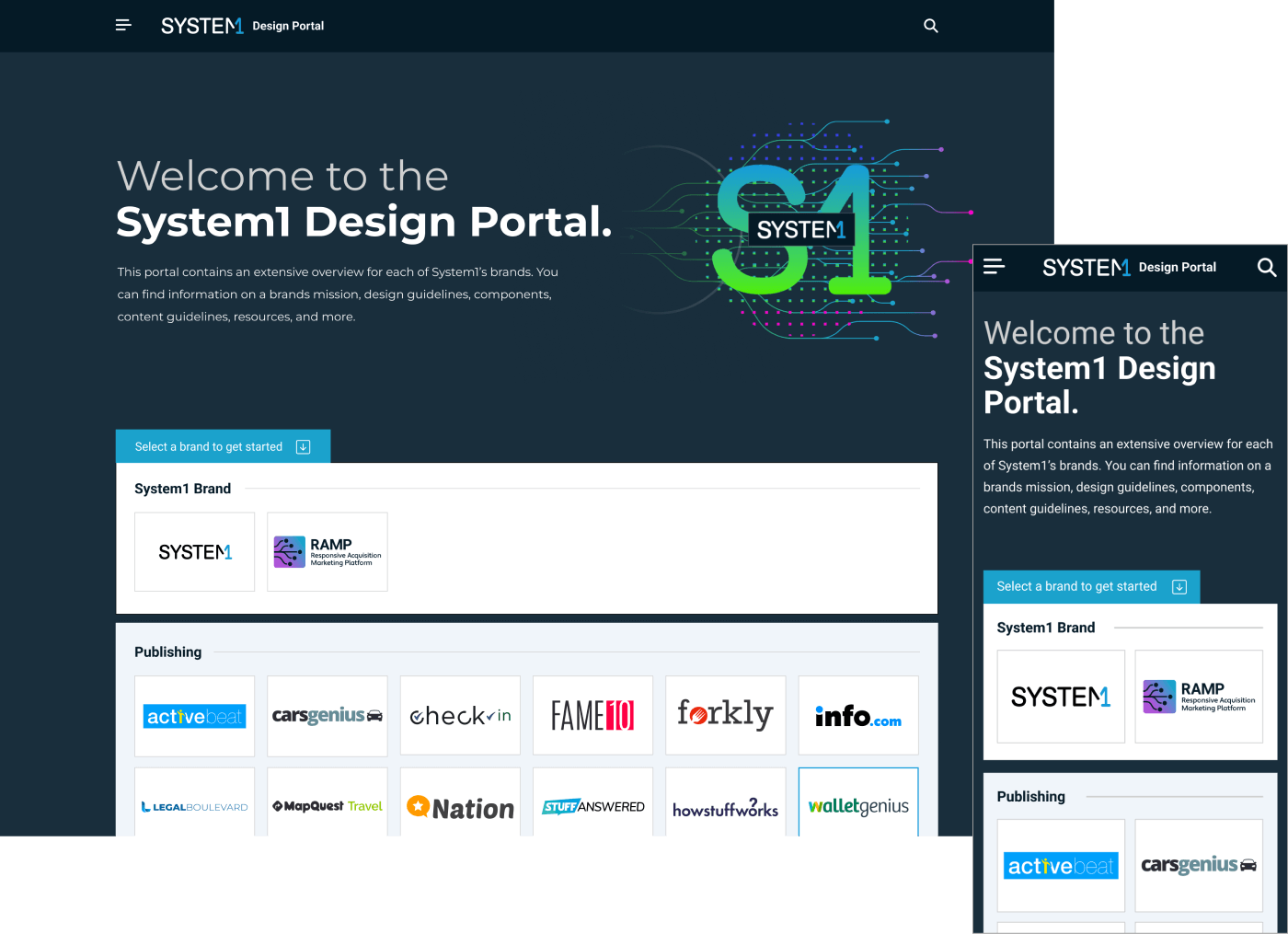
Mobile and desktop mockups were created to visualize the portal's layout and functionality across different devices, ensuring consistency and usability across various platforms. Throughout the UI design process, I received feedback on design variations from designers on my team.

Incorporating unique brand identities
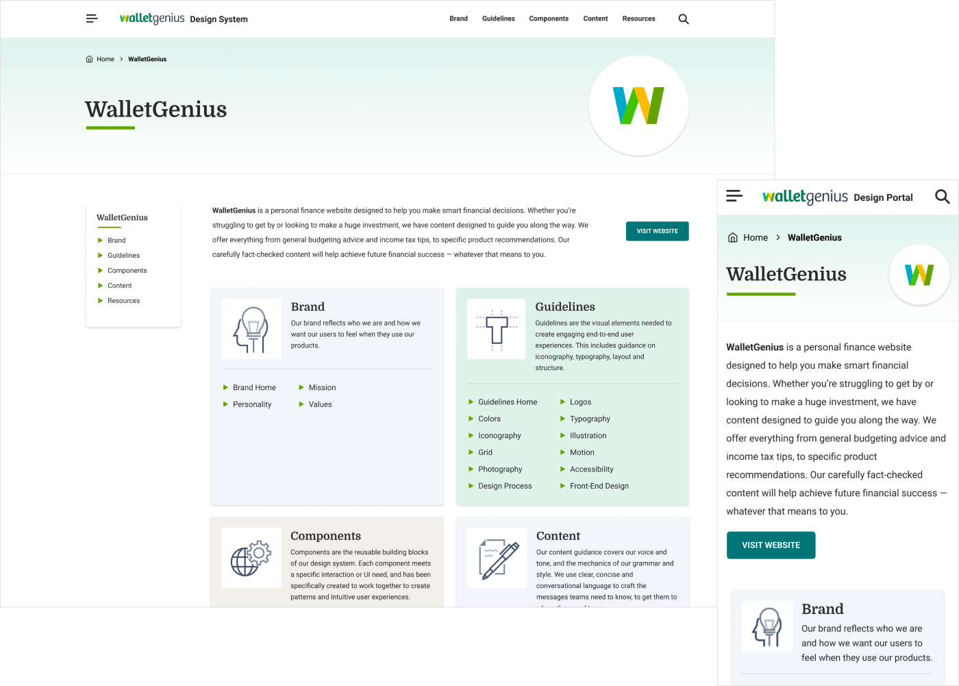
Maintaining consistent branding elements throughout the UI design was crucial, encompassing colors, typography, and imagery. Each design system aligns with its respective website and style guide, ensuring coherence and reinforcing brand identity across all brand representations within the portal.

Accessibility considerations
I always prioritized accessibility best practices for each design system, for example, ensuring high contrast ratios, scalable font sizes, and keyboard navigation. This approach guarantees inclusivity and compliance with accessibility standards (WCAG AA).

Building the portal
I designed a custom WordPress theme prioritizing ease of editing, enabling stakeholders to make updates and modifications as needed. Later in the process, I collaborated with developers to put some final touches into the portal.
Modern HTML, CSS and JS were utilized in the development process. Responsive design principles were implemented to ensure optimal viewing and interaction experiences across a wide range of devices and screen sizes.

The review stage
Feedback was incorporated to refine and optimize each brand's design system within the portal. Training sessions were conducted, and documentation was provided.
As a test, I asked developers to complete new tasks using the design portal's guidelines and track their completion times. On average, this approach reduced development time by 30%!
Designers were similarly tasked when designing new interfaces for existing projects, resulting in increased design speed and consistency. Reusable components, naming conventions, and color and typography guidelines all contributed to this improvement.

Design system features
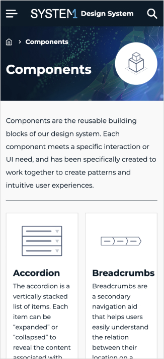
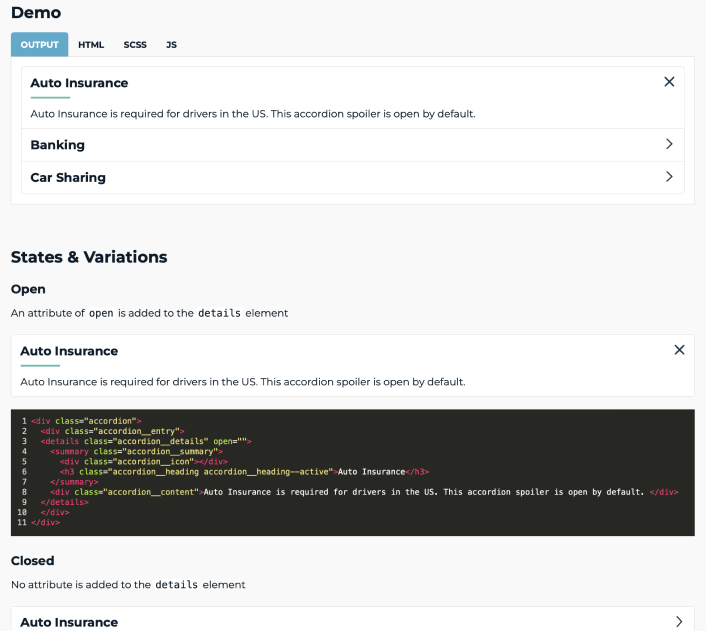
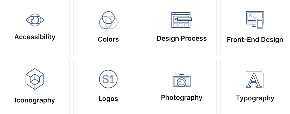
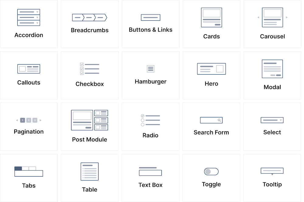
Each design system contains many guidelines, including best practices for accessibility, typography, and logos. Each component guideline includes a working demo built with HTML, CSS, and JavaScript, as well as naming conventions and variations. There are also content guidelines for writers and editors, along with resources for downloading logos and fonts.
The outcome
- I introduced the design portal to over 200 employees at a company-wide meeting, and it quickly became a key part of onboarding, helping new hires get up to speed with the design system.
- Engineers and designers integrated the design portal into their workflows, resulting in increased design speed and consistency, and a ~30% reduction in development time.
- I championed and promoted the design portal, leading to company-wide use. Employees gained a better understanding of design system thinking, and how they can utilize our design systems.

Learnings
- Businesses move fast, and deadlines are tight, so not everyone can proactively contribute to a design system. Therefore, I would always need to stay on top of it to ensure its maintenance and effectiveness.
- Not every brand needs an in-depth design system. Some have different requirements and can function well with just the basics.
- Always provide documentation whenever possible.
- Test component variations extensively with users.
- Maintain continuous communication.
- A design system is never done.
