
The Process
The Problem
WalletGenius needed a complete design overhaul in order to reinvigorate the brand, and improve the overall user experience.
Goals
- Enhance the user experience: Craft a fresh, innovative design that not only prioritizes user experience but also incorporates intuitive interfaces and interactive elements, ensuring higher engagement and satisfaction for visitors.
- Optimize ad click-through: Strategically encourage user interaction with advertisements within article pages to improve ad click-through rates and monetization opportunities.
Research + UX
Right from the start, our team dove deep into research, covering everything from defining the brand's style to figuring out who we're targeting and what our competition's up to. We would need to do a full revamp of the website, which was a big deal and needed a ton of planning and attention to detail.
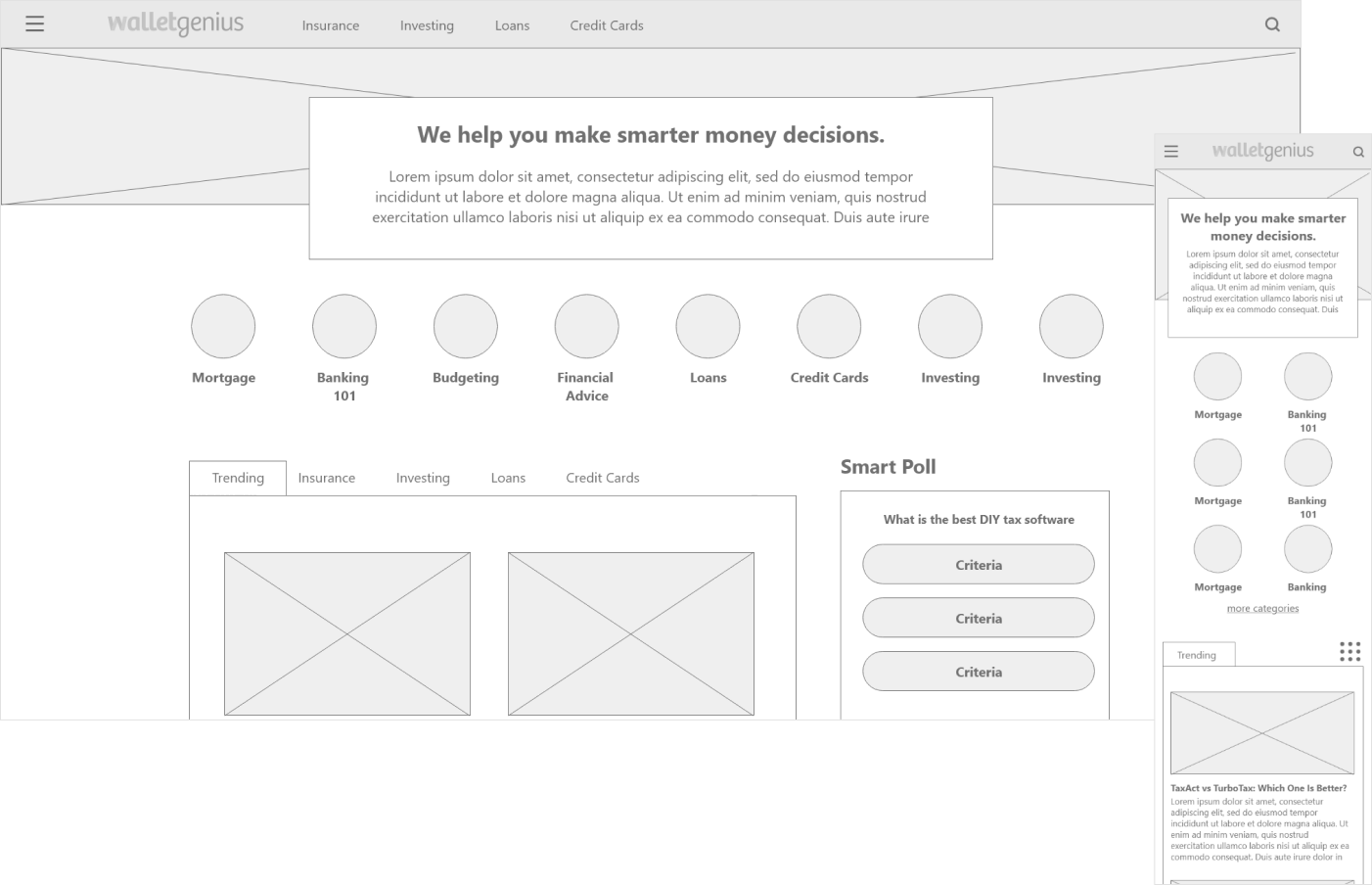
I first focused on making moodboards showcasing a diverse range of aesthetics. Concurrently, I worked alongside a teammate on wireframes which helped us figure out how elements should be laid out on each page.
This approach laid a strong foundation for the redesign, making sure it matched the brand's goals, met user needs, and set us up nicely for the next steps in development.
Style Guide
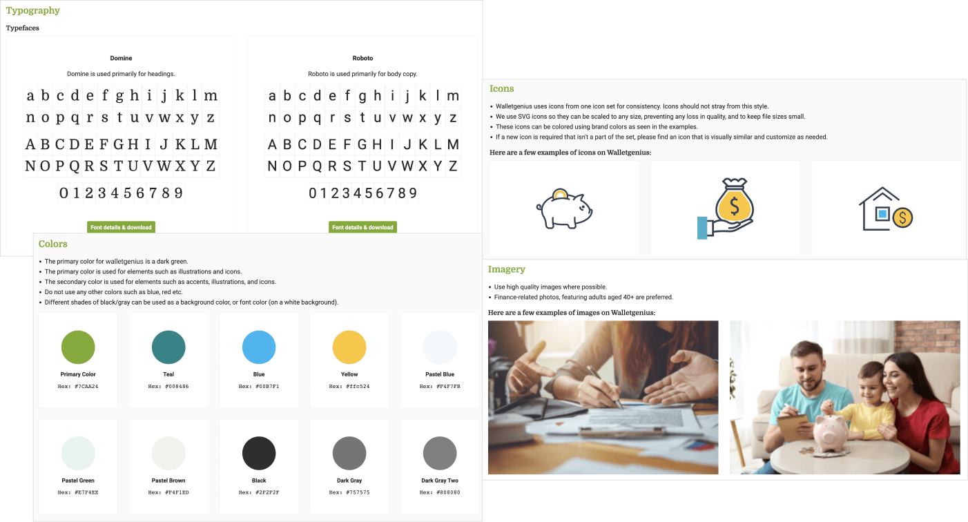
As the design process began, I created a style guide for the website. The style guide included guidelines for colors, typography, icons, and photography. I chose a combination of bright primary, accent, and pastel colors to reinforce the finance-theme and create a friendly and positive vibe for the brand. The style guide ensured consistency in design elements and facilitated a cohesive user experience.
A fresh brand
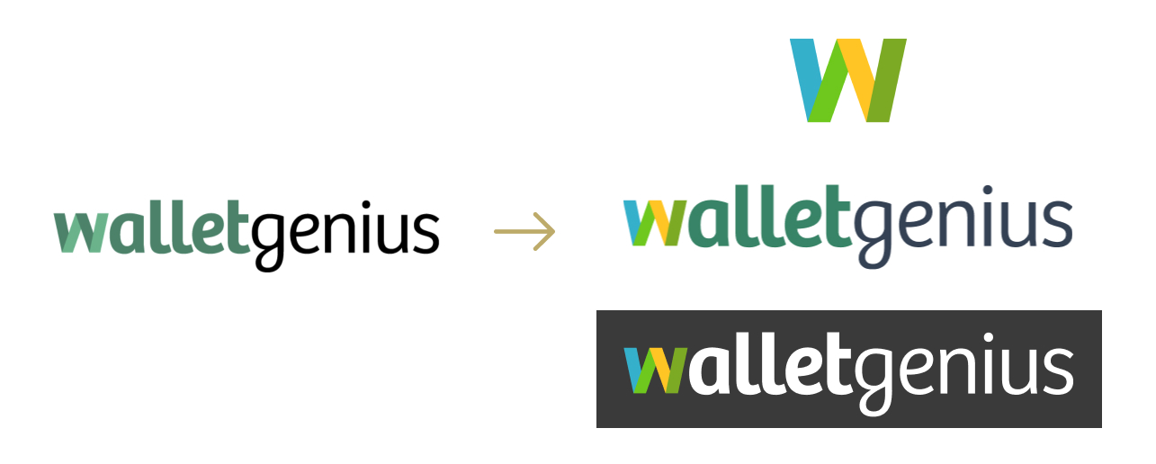
To align with our evolving target demographic, it was essential to update the logo. While the previous logo solely relied on green to signify finance, we recognized the need to infuse it with a fresh color palette that promoted friendliness and trustworthiness. This strategic enhancement revitalized the brand while maintaining a sense of familiarity for existing users.
UI Design
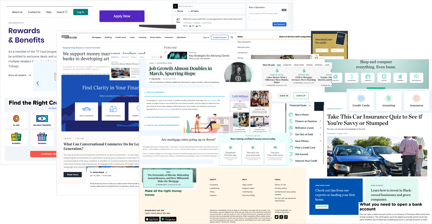
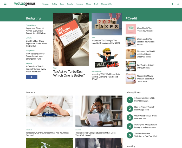
We proceeded to craft mobile and desktop mockups that reflected the new design vision. It was evident that the original site conveyed a sense of strictness and rigidity, along with an outdated visual appearance.
Before
After
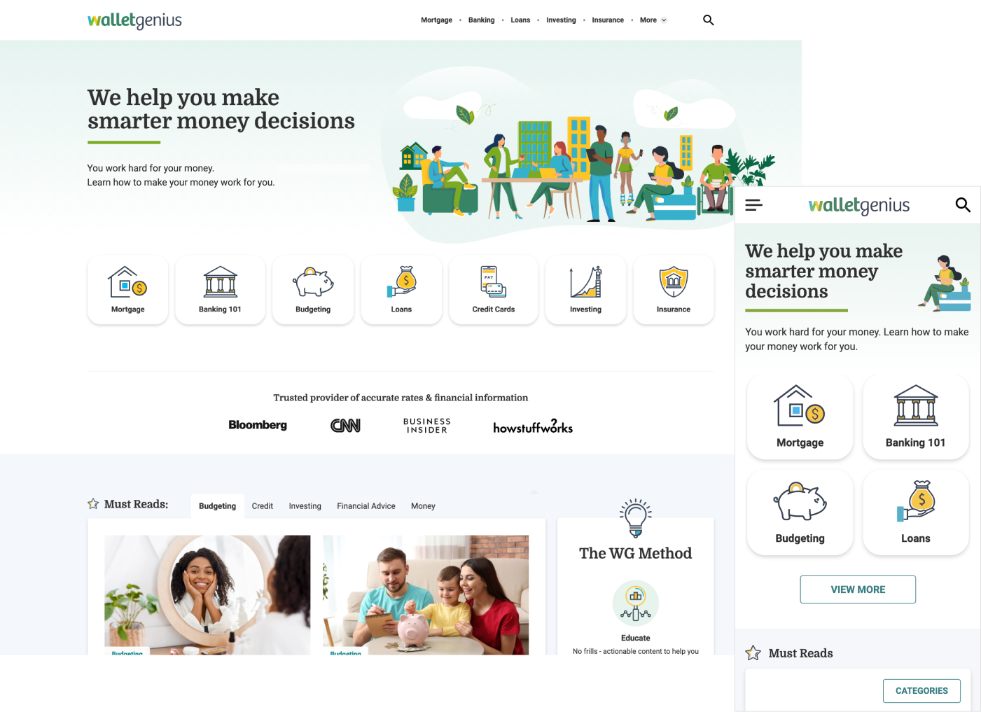
Our primary objective was to infuse the design with a sense of fluidity and contemporary aesthetics. Our approach involved implementing modern design principles to deliver a fresh and engaging user experience that aligned with current industry standards.
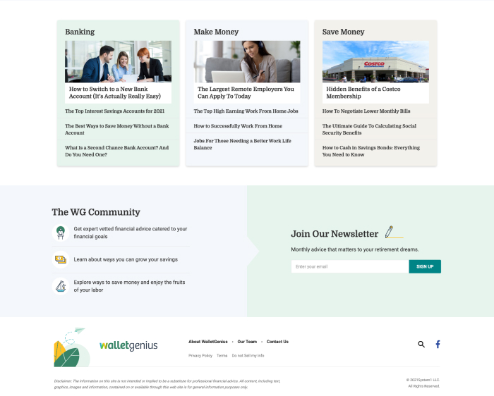
To enhance the appeal of the website, we introduced meaningful content, vibrant colors, and captivating icons and illustrations throughout the pages. One of my teammates took charge of creating eye-catching hero illustrations that not only strengthened the brand's identity but also integrated perfectly with the brand's color scheme.
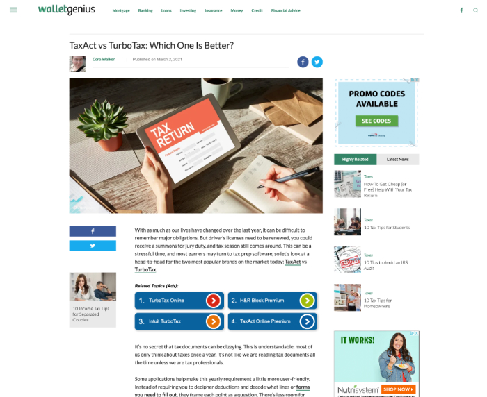
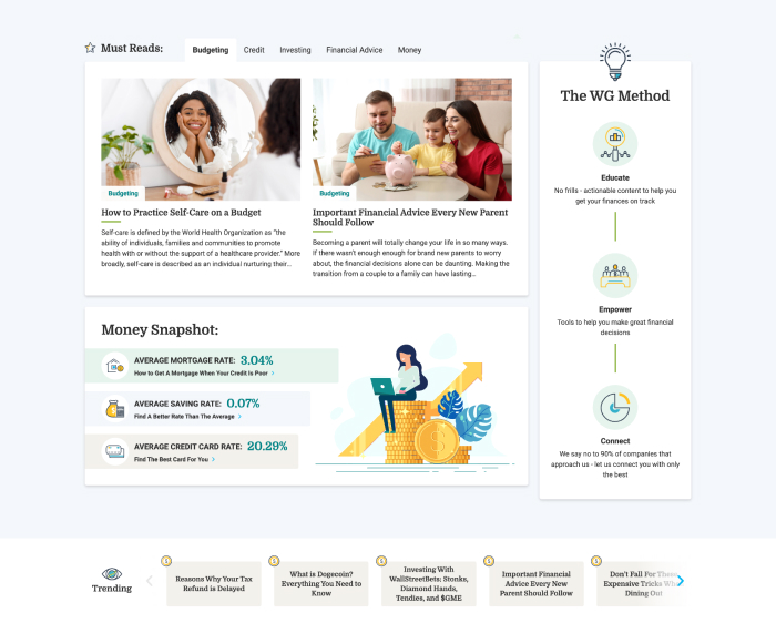
The article page on WalletGenius is the site's most critical component, and great emphasis was placed on presenting a clean and uncluttered layout.
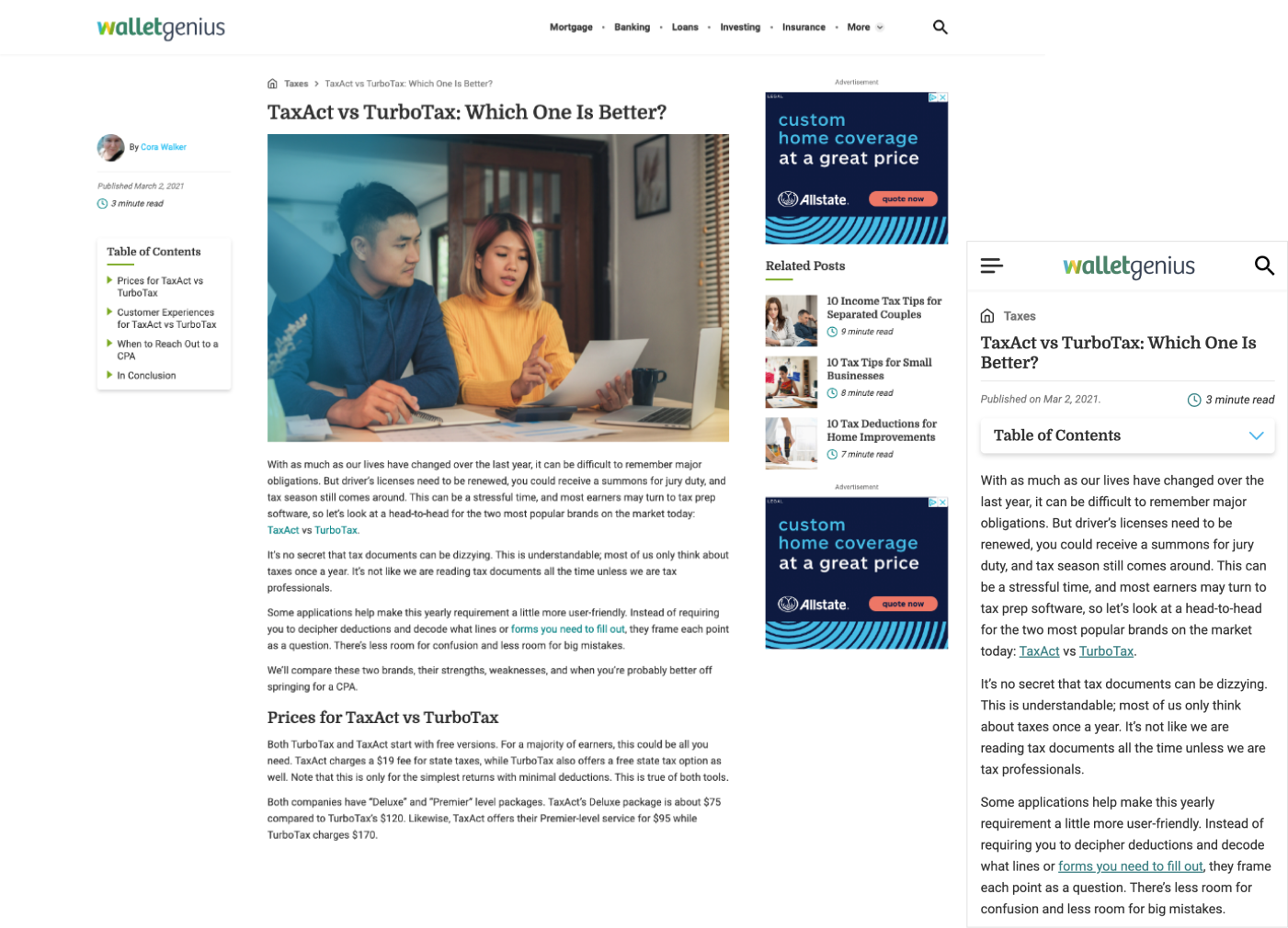
To meet the highest standards of inclusivity, all font choices and color combinations underwent testing to ensure compliance with WCAG AA (Web Content Accessibility Guidelines) contrast requirements.
Build Phase
I provided support to the development team by transforming my mockups into an optimized and streamlined WordPress theme.
My responsibilities encompassed constructing the HTML, SCSS, and any interactions with JavaScript. To ensure consistency and adherence to best practices, I formulated a comprehensive set of markup and CSS guidelines that served as a reference for every developer involved.
Outcome
- Enhanced user experience: Users reported high satisfaction with the site's usability, resulting in increased time spent on pages and reduced bounce rates.
- Visual appeal: The modernized appearance attracted more visitors and positively influenced brand perception, improving credibility.
- Engagement: WalletGenius garnered significant traffic (1,000,000+ monthly visits via paid and organic traffic!), with users actively engaging articles and the advertising throughout.