Project Goals
- Increase content engagement:
While the project encompassed a full-site redesign, the primary focus was on the article page layout to specifically target and reduce bounce rates. - Optimize ad integration:
Strategically integrate high-performing ad units into the content flow to increase CTR without degrading perceived site speed or accessibility. - Overhaul the vehicle finder:
Redesign the entire vehicle discovery experience to align with the new design system—introducing optimized navigation and quick-search features to minimize user drop-off.
Research
Understanding the Market
Analyzing competitors like Auto Trader and MotorTrend revealed a common flaw: cluttered, ad-heavy layouts often compromised the reading experience. To ensure CarsGenius remained competitive, I documented these industry pitfalls, concluding that a premium, uncluttered interface could serve as a unique differentiator in the crowded auto-publishing sector.
Understanding Our Users
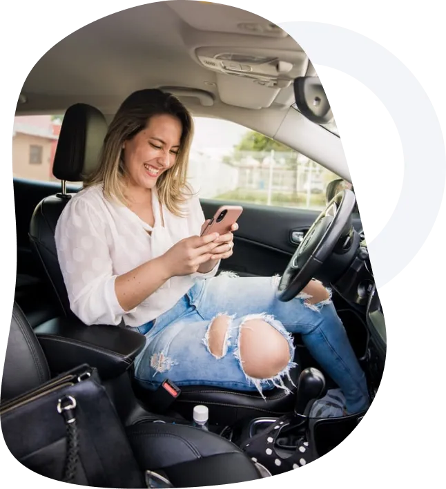
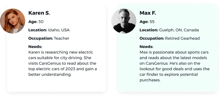
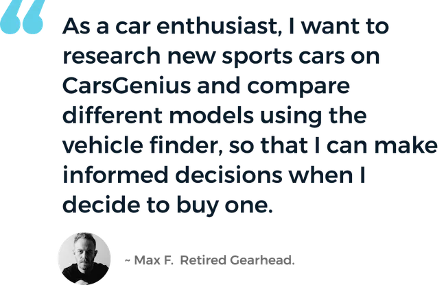
Initial data from the previous website showed that the majority of our users are 30–50 years old, and 90% of the traffic is mobile based. This influenced the design direction — prioritizing a mobile-first experience and key accessibility decisions. I created straightforward user personas and a user story to define who would use CarsGenius and why.
Design Process
-
Collaboration
Throughout the project, I worked closely with project managers, developers, and stakeholders to keep everyone aligned. I used user testing and team feedback to tweak the designs and ensure we met our goals.
I regularly updated senior leadership on my progress, showing how design choices supported business objectives. I used metrics and feedback to highlight the impact of changes, adjusting the design accordingly.
-
Developing User Flows
With the user personas as a guide, I developed user flows to give stakeholders and the team a clear picture of how users would move from point A to point B. On the auto blog, the business goal is to reach an article page and progress through an advertising funnel.
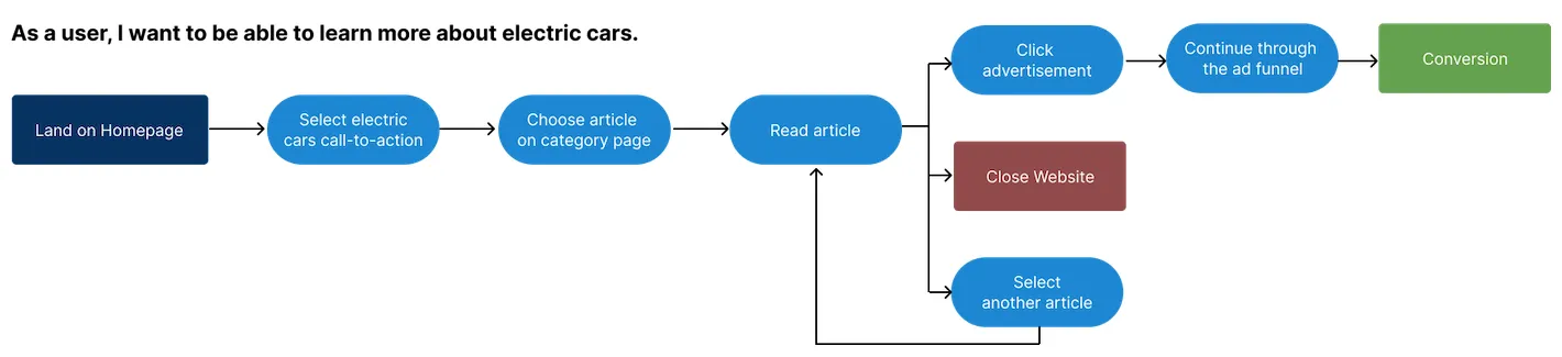
User flow for the auto blog experience. -
Framing the Layout
While the vehicle finder had an existing layout, we needed to establish what elements would appear on each blog page. I leveraged data from previous websites to inform ad placement hypotheses, then brainstormed and created over 20 lo-fidelity wireframes.
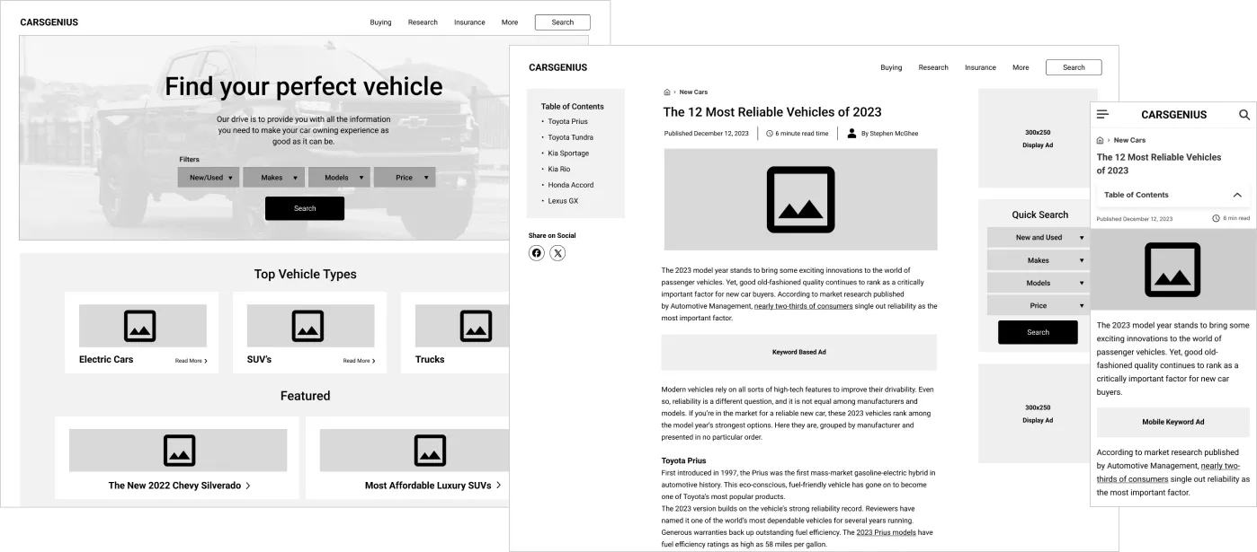
Lo-fidelity wireframes exploring page structure. -
Creative Inspiration
To explore the visual direction, I created three distinct moodboards: one conventional, one modern and high-end, and one unconventional, whimsical, and organic. These were sourced from competitor websites and unrelated design inspiration.
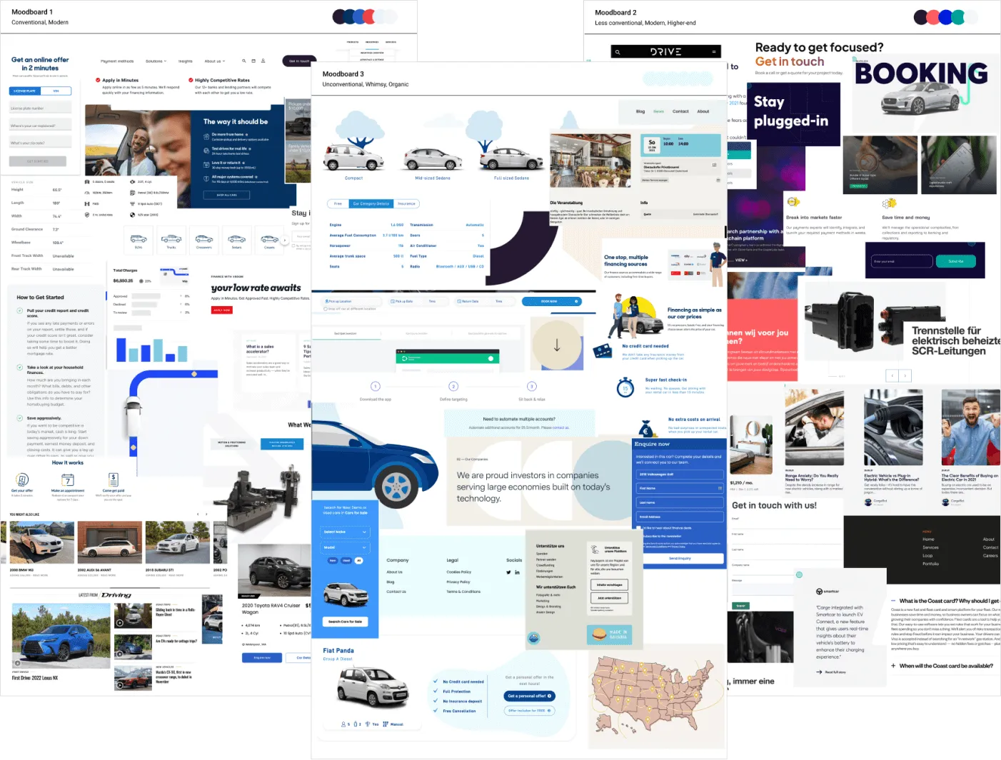
Three distinct moodboard directions. -
Early Testing & The Pivot
After narrowing down to two themes, concept testing with users revealed a clear winner: 7 out of 10 users preferred a 'playful and organic' visual direction over the rigid, technical layouts common in the auto sector. While this direction was deemed a risk internally, I successfully advocated for it by anchoring it back to our personas: our audience valued clarity and approachability over a spec-sheet interface.
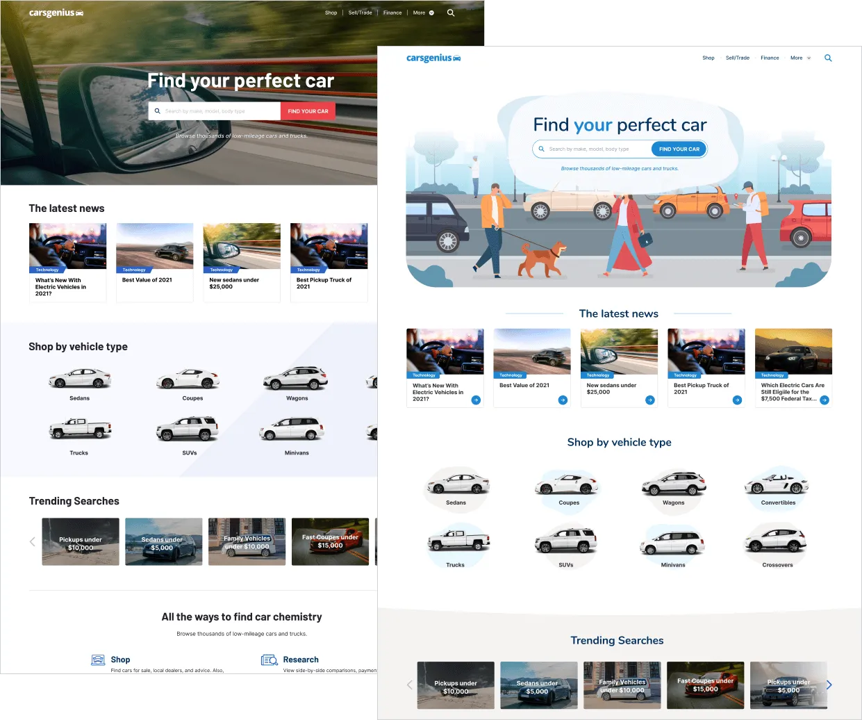
Early A/B test comparing design directions. -
Building a Design System
I developed a scalable design system and style guide to ensure visual consistency and enable future expansion — smooth integration of new features and advertising formats. Figma's component variations and variables were used to make reusability easy across the project.
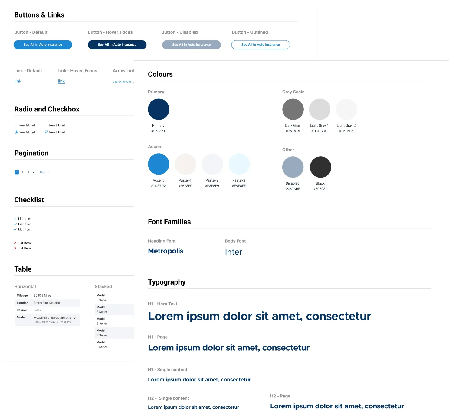
Style guide foundations. 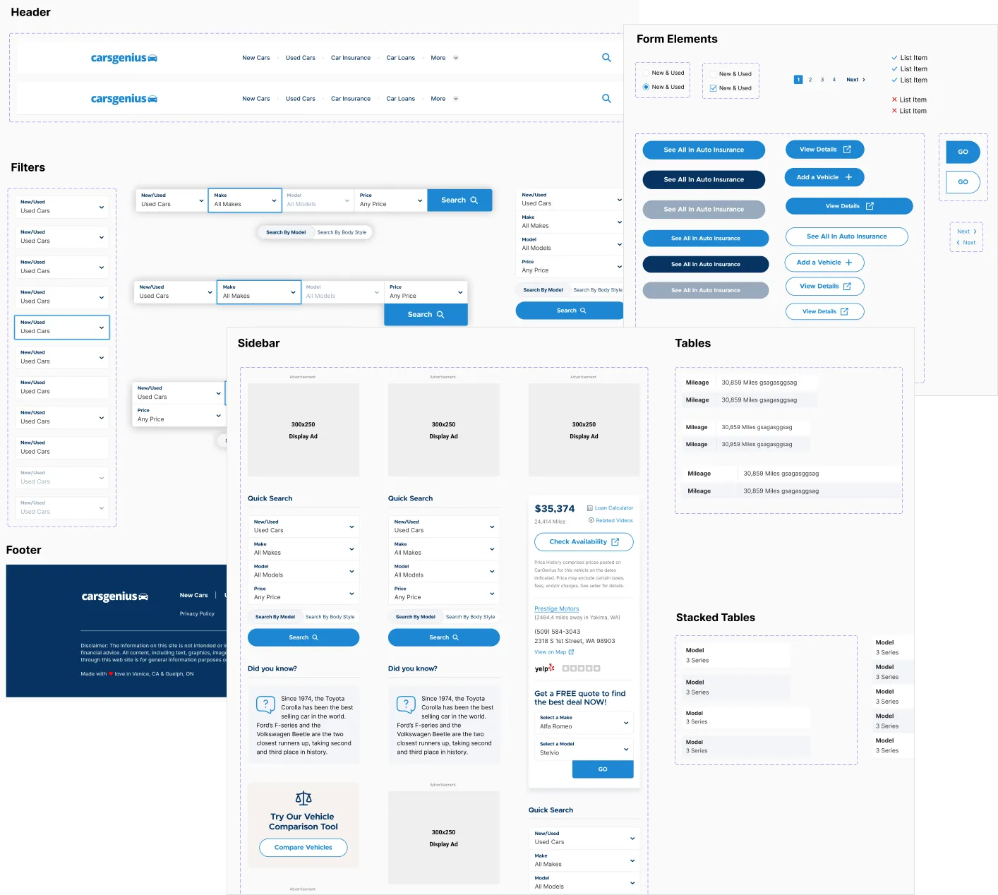
Component library in Figma.
Visual Design
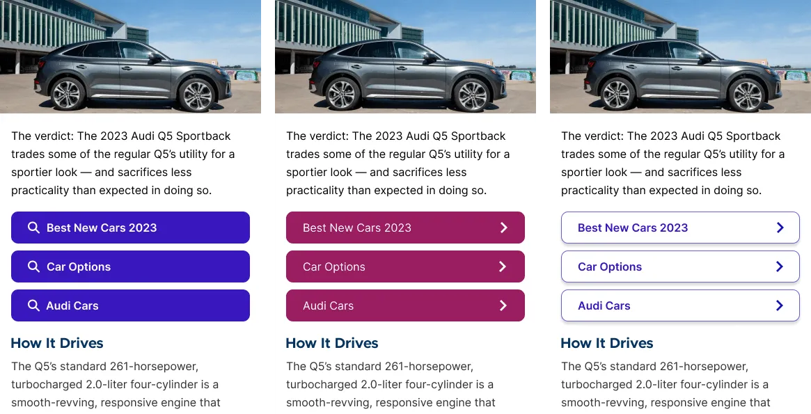
Drawing from the moodboards and early testing, I designed the UI with a combination of modern typography, bold colors, and organic shapes. In all, I designed over 40 mockups, with several iterations along the way. Weekly design reviews with stakeholders ensured all feedback was addressed. All font choices and color combinations underwent testing to ensure WCAG AA compliance.
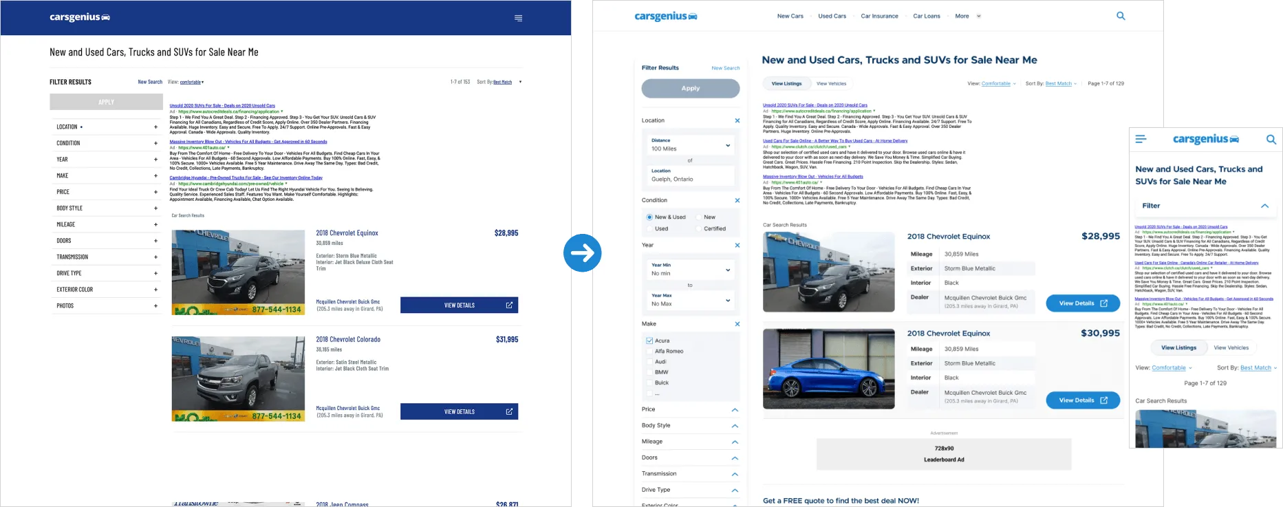
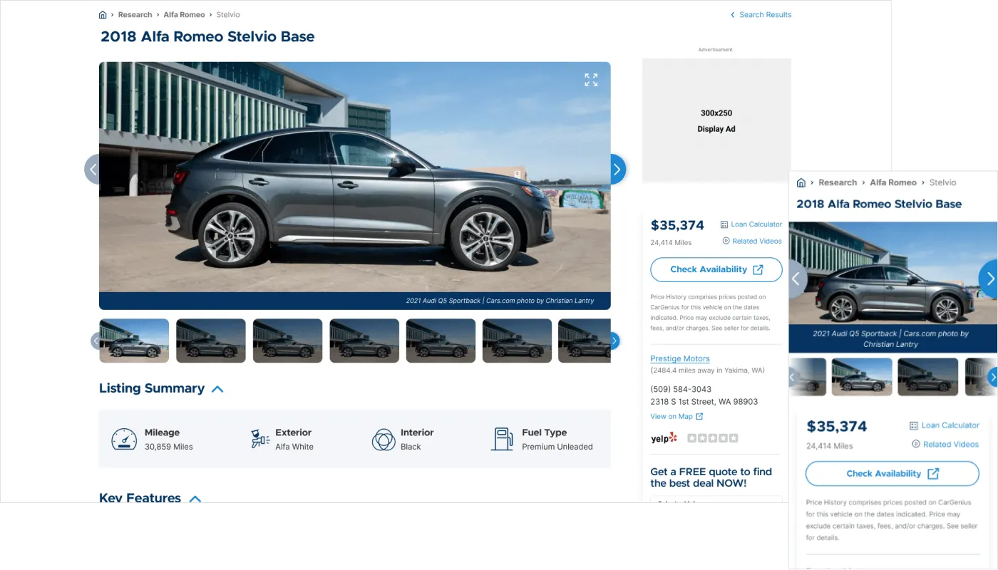
The article page is the most critical component due to the traffic and advertising it receives. A great emphasis was placed on presenting a clean, uncluttered layout.
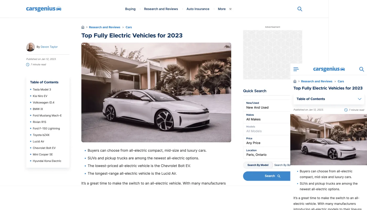
To improve ad click-through rates, the most important advertising was placed above the fold. Display ads in the sidebar, Google ads within content, and various placement positions (below the header, title, specific paragraphs) were all tested using internal tools. After extensive experimentation, I found solutions that improved click-through rates by 8%–10%.
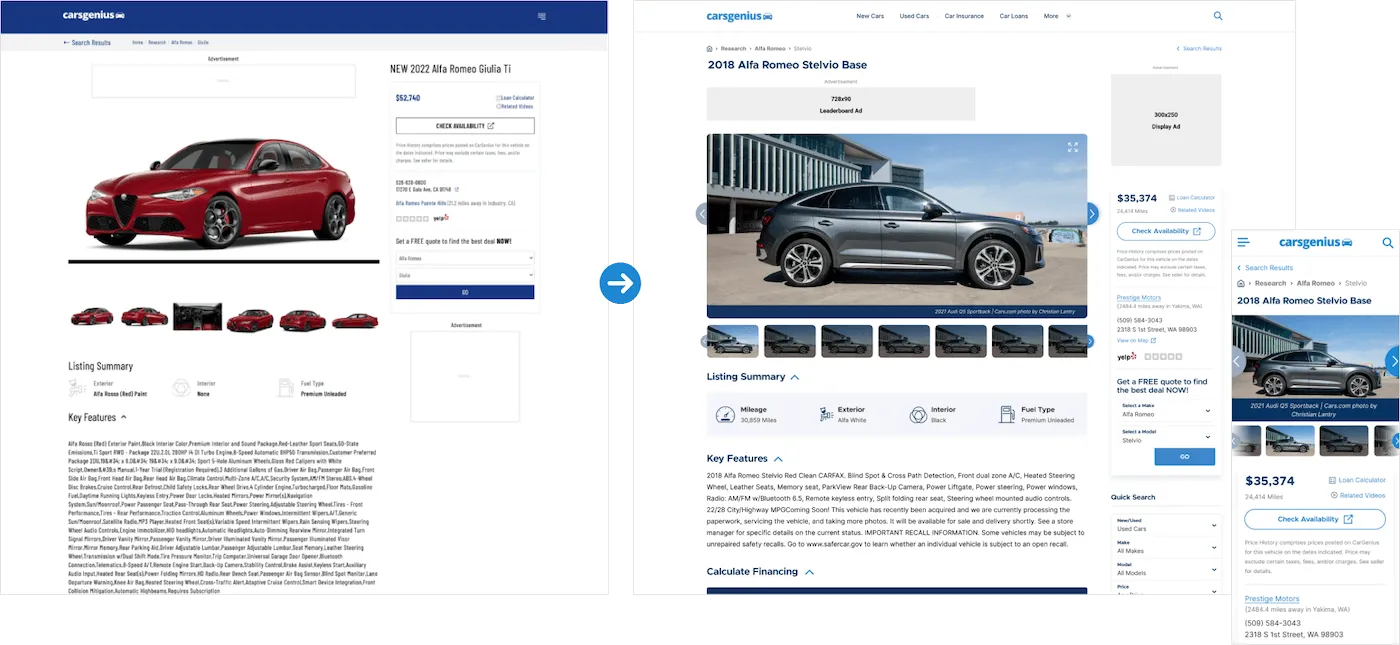
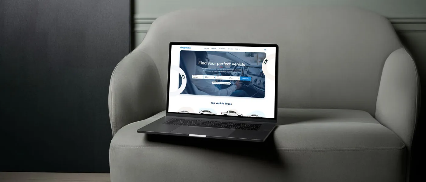
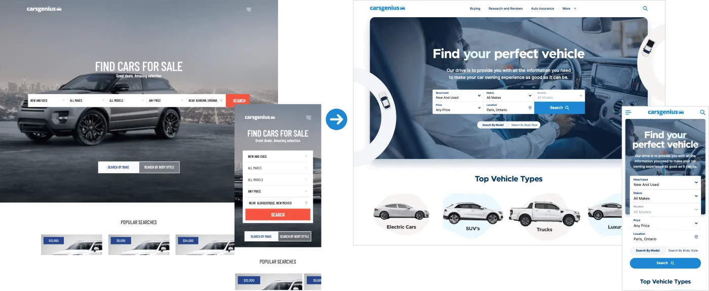
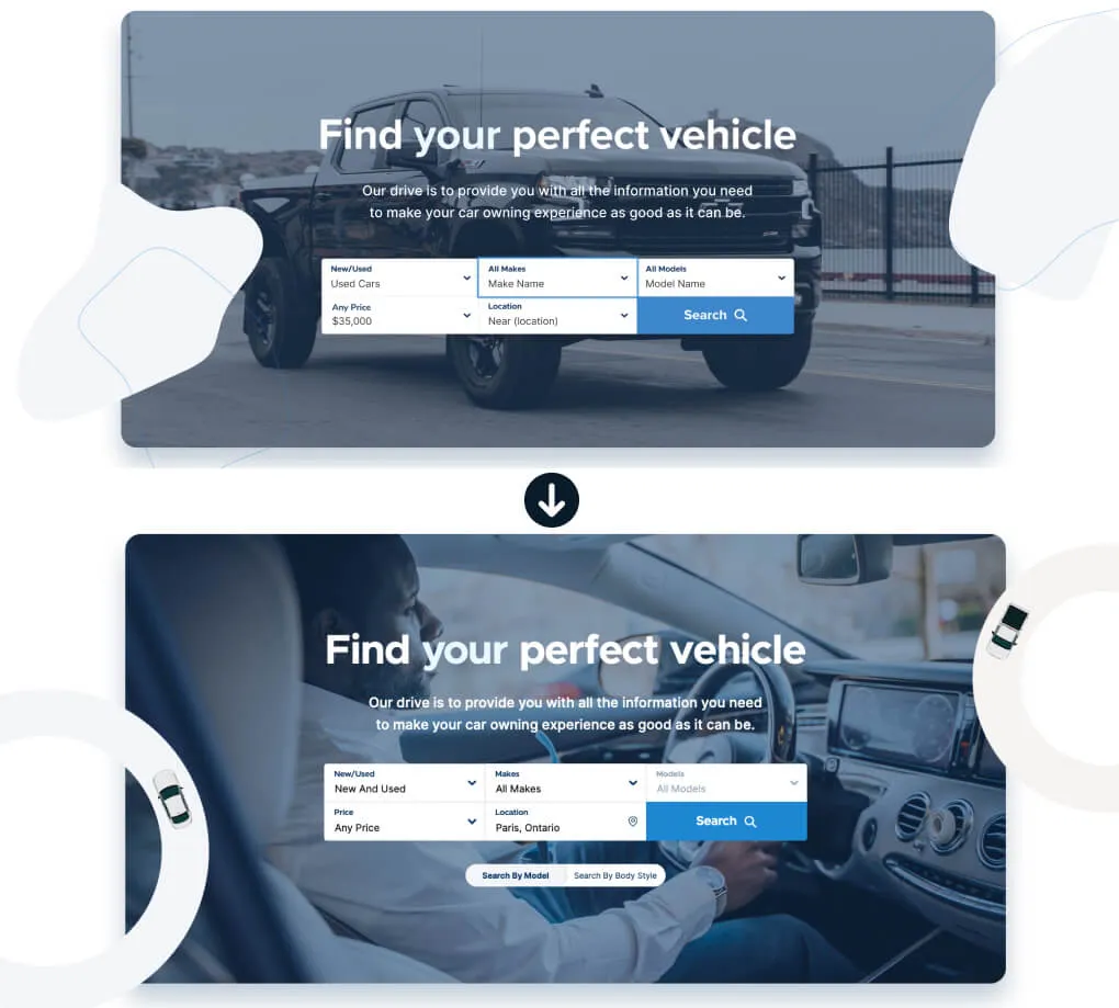
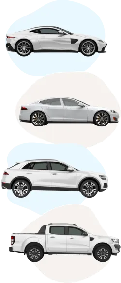
The vehicle finder underwent a complete visual and structural overhaul to align with the new design system. I implemented a new navigation, adjusted heading hierarchies for better scannability, and introduced quick-search features—all of which were validated through testing to ensure an improved user experience.
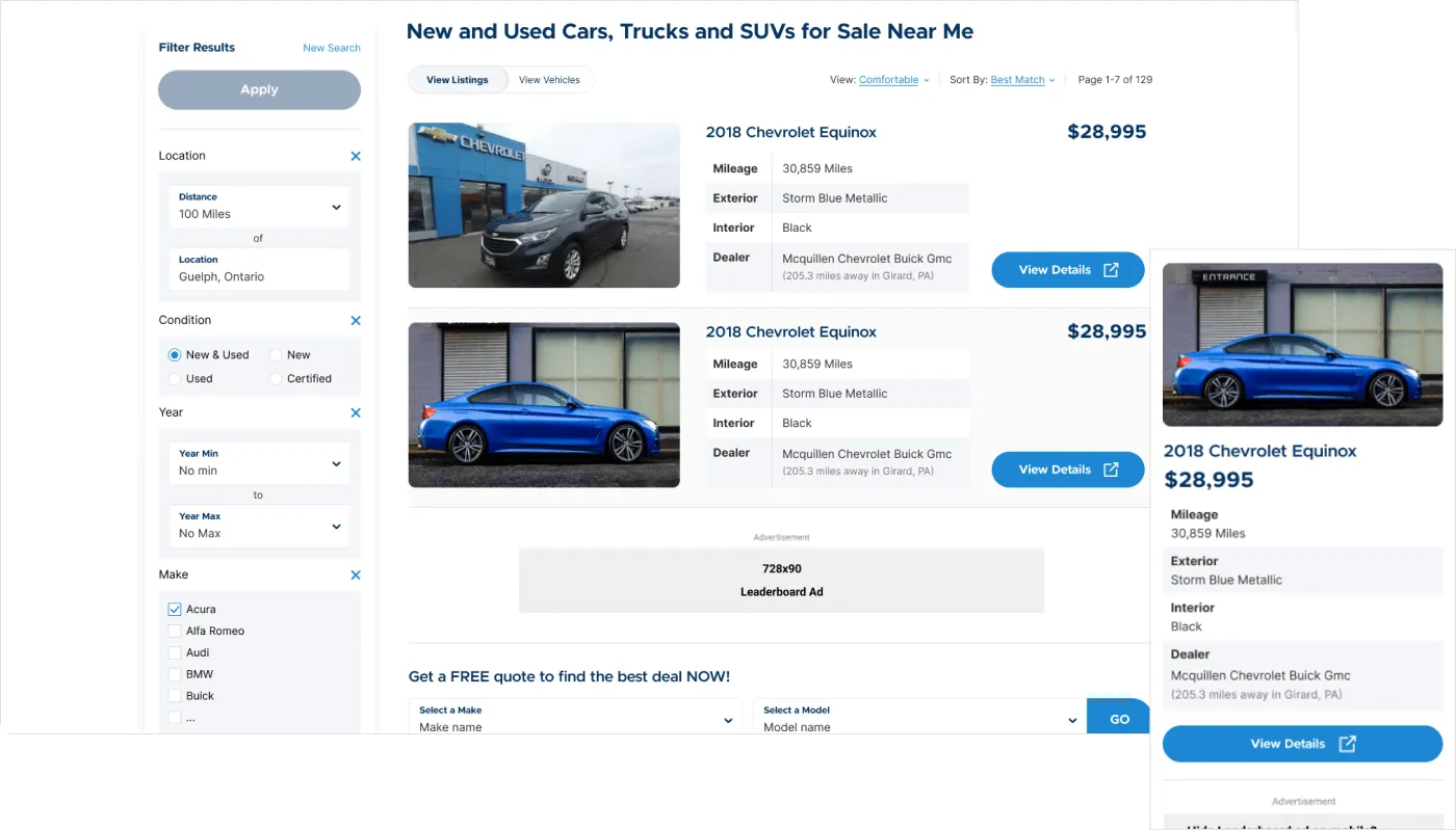
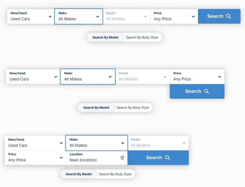
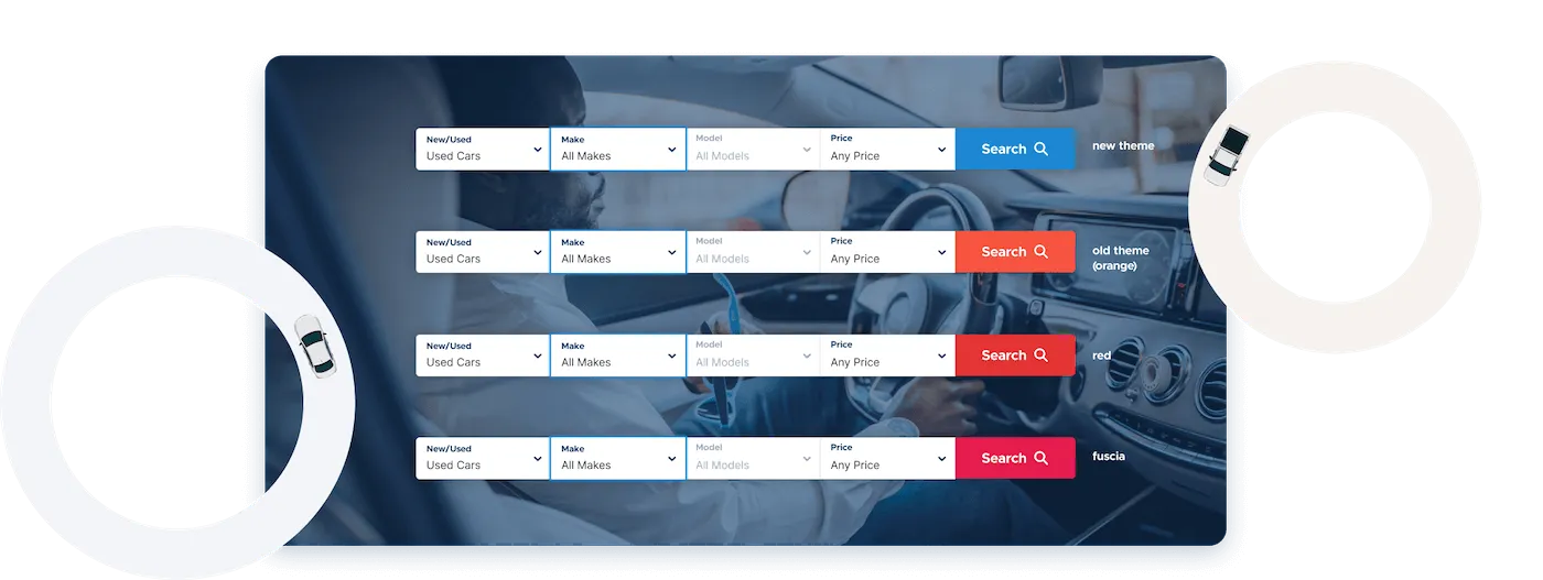
Below is an example of a design tested to improve performance. A simple colour change to the vehicle finder's search button improved click-through rates by 5% (based on 5,000+ users over 2–3 days on mobile and desktop).
Build Phase
To accelerate time-to-market and bridge the gap between design and development, I built out the production HTML, SCSS, and JavaScript interactions myself. This hands-on approach allowed me to strictly enforce WCAG AA accessibility standards right from the start, and provided a robust CSS framework that served as the source of truth for the backend team.
Accessibility was a core consideration throughout development. I incorporated accessible markup, keyboard focus support, screen-reader compatibility, and color contrast testing.
Outcome
- Improved engagement: After launch, users reported greater satisfaction with the blog's design and usability, leading to lower bounce rates and session lengths increasing by up to 2 minutes (from a 30-second average).
- Significant traffic gains: CarsGenius reached 1.2 million monthly visits via paid and organic traffic, with users actively engaging articles and ads throughout.
- 8%–10% increase in ad CTR: Optimizing the article page and ad placement reduced page load times and meaningfully boosted click-through rates.
- The vehicle finder redesign has not yet launched due to other company priorities.
Learnings
- Always share new design updates with your team and senior stakeholders. Getting feedback from everyone helps keep the project aligned with business goals.
- Ads were a key focus, but user experience was equally important. By prioritizing smart ad placement and design, I found solutions that boosted performance without hurting usability.
- Data is everything. It helped me understand our users and predict whether a design or component would succeed.
- Make it a habit to review developer output. I gave feedback during meetings and on GitHub when the final result didn't match my designs.