The Challenge
Scaling Across 10+ Properties
System1 operates a massive portfolio of diverse brands. Our overarching challenge was dual-faceted due to how teams were structured:
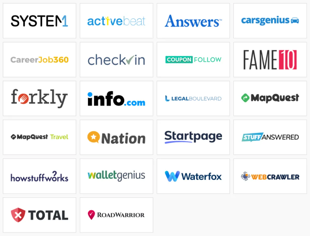
- Independent Brands: Major properties like MapQuest, Waterfox, and Total had their own dedicated design teams and independent style guides housed deep within siloed Figma files.
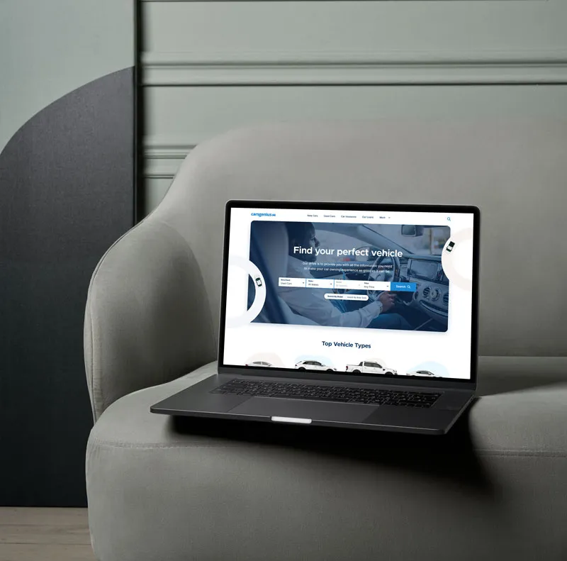
- Internal Core Brands: In the Guelph office where I was based, our team of designers and front-end engineers actively built and maintained a core family of brands (Checkin, Legalboulevard, Nation, Stuffanswered, Walletgenius, CarsGenius).
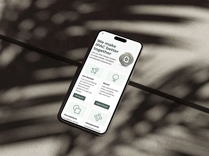
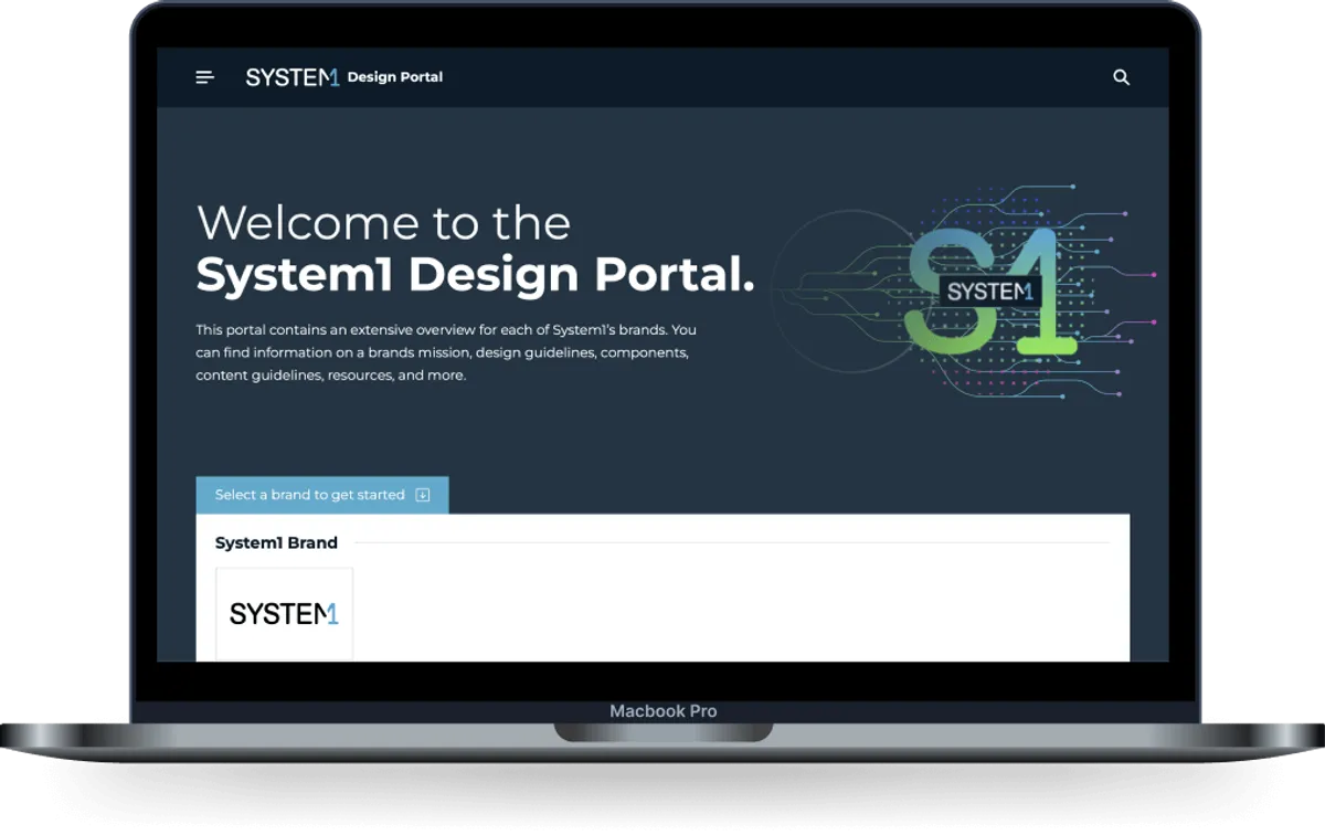
Initially, we relied on basic style guides for our internal brands. However, as the portfolio grew, inconsistencies compounded. I recognized the need to evolve these guides into fully-fledged design system websites and, crucially, create a single, unified gateway—the Design Portal—that could house the documentation for all System1 brands, regardless of the team that built them.
Discovery & Research
Understanding Our Users
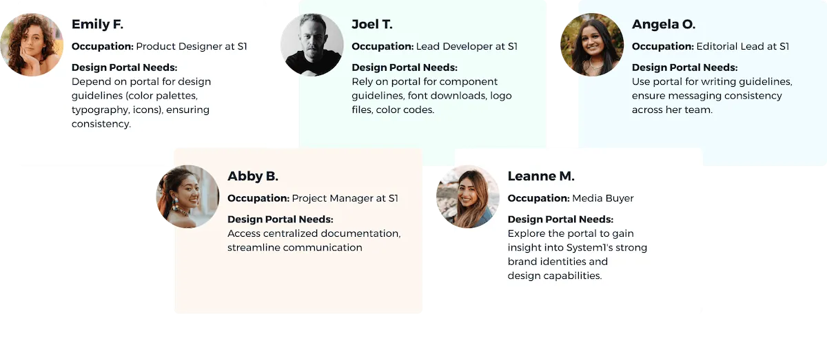
I crafted straightforward user personas to grasp who would utilize the design portal and for what purposes. While the majority of the user base is internal (designers and engineers), we also considered external users who might visit the site for insight into System1 brands.
Shared Templates & Tokens
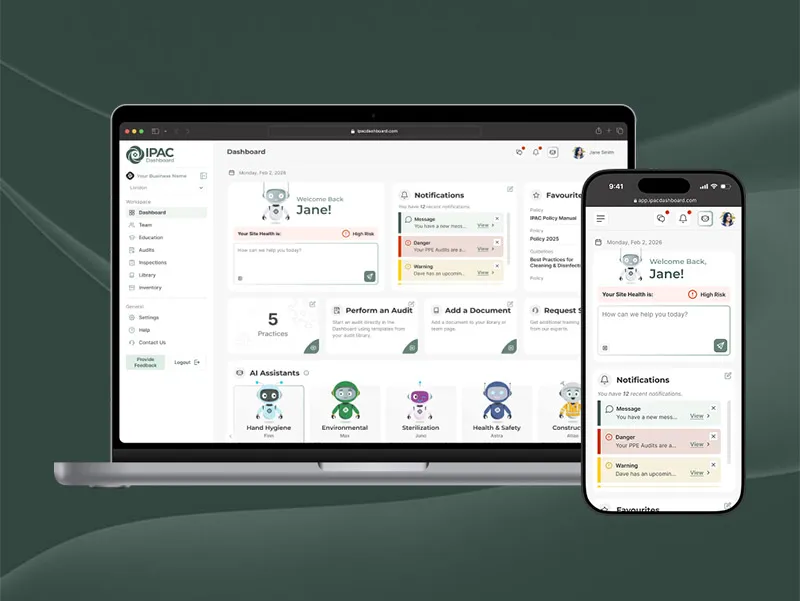
Scaling the Core Brands
For the core brands, the team leaned heavily into establishing a
shared base design template and code base to make it easier to
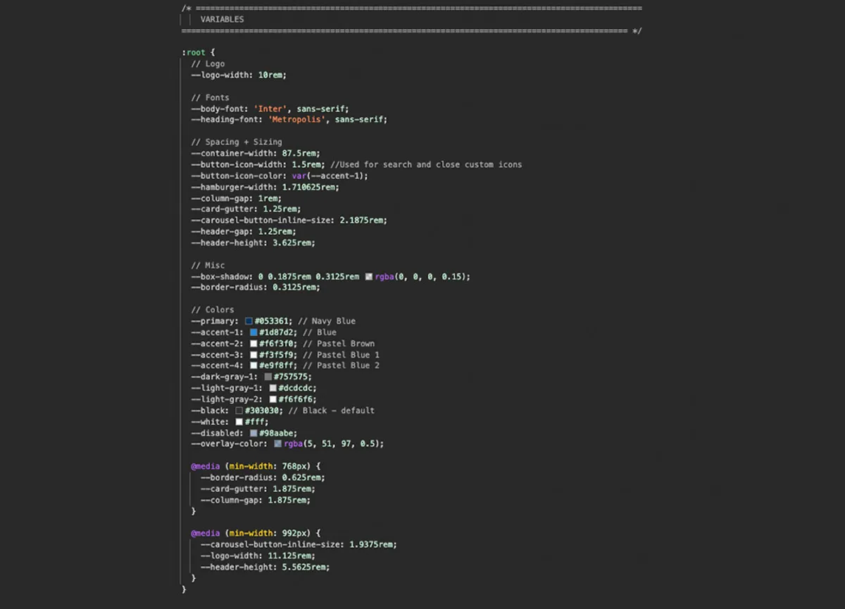
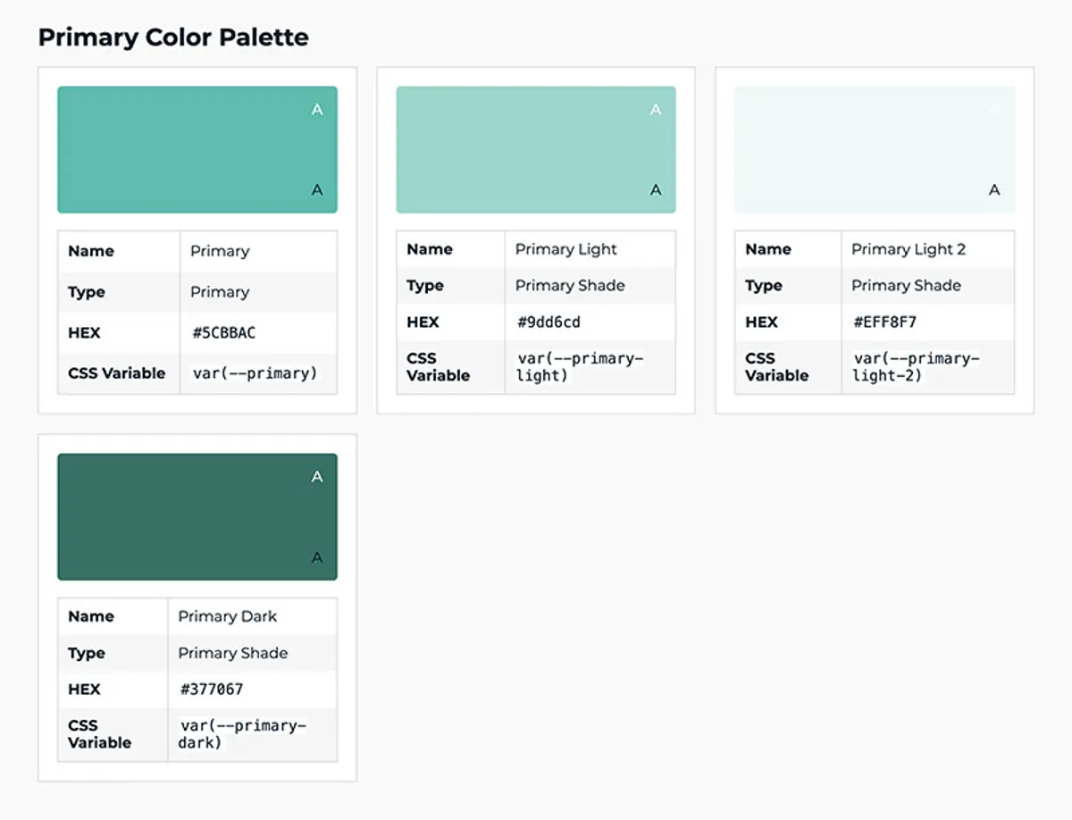
maintain and create new sites. When it came to tokens, I abstracted
hard-coded hex values into simple, semantic token names like primary and
secondary, while fonts would use body-font and
heading-font.
This architecture allowed us to build structurally similar—yet visually distinct—properties at lightning speed. By maintaining a shared structural DNA across all core brands, we could quickly apply unique brand identities simply by adjusting the foundational variable tokens.
Lean & Effective Systems
Purposeful Simplicity
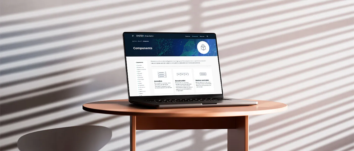
A common trap in design systems is over-engineering. For an umbrella company of this scale, the design systems themselves were purposefully kept fairly basic—focusing strictly on what drove the most value, such as: colors, logos, and typography rules.
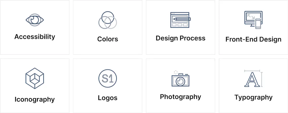
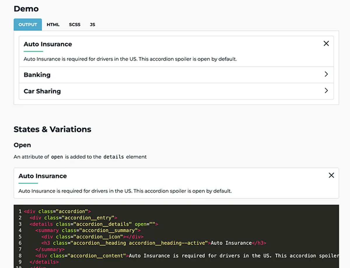
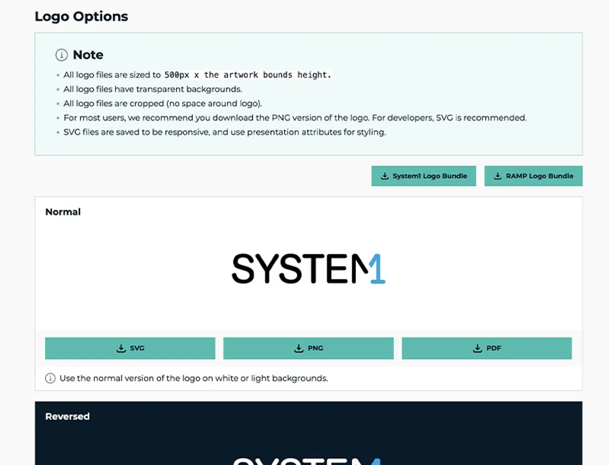
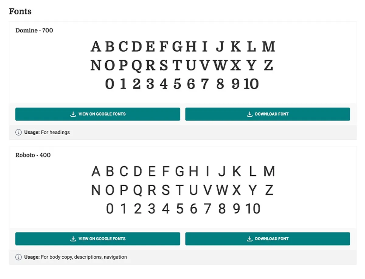
However, I ensured that this "basic" foundation was highly actionable. Every component provided working demos, showcasing proper usage, anatomy, and interactive states. This provided exactly enough structure without bogging down the diverse engineering teams in unnecessary complication.
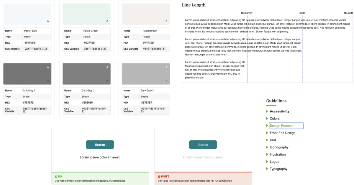
Accessibility by Design
I made sure to include basic accessibility guidelines within the System1 Design Portal so teams could ensure their respective brands adhered to best practices from the start. The portal includes straightforward guidelines on colour accessibility, providing visual tests of light and dark fonts applied over brand colours. It also establishes rules for ideal line lengths to improve reading comprehension, heading hierarchy, keyboard navigation, semantic HTML, proper image alt tags, and ensures buttons meet standard contrast ratios.
Centralizing Documentation
The Single Source of Truth
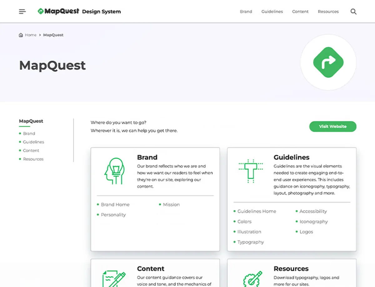
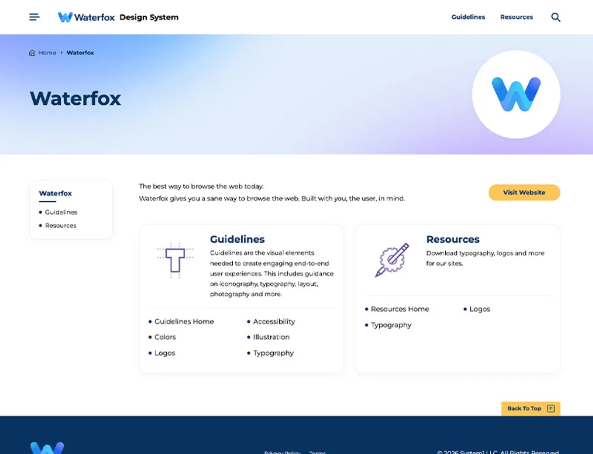
To build the ultimate source of truth, I collaborated across departments. I worked directly with the independent teams managing MapQuest, Waterfox, and Total to port their isolated Figma guidelines into the central portal.
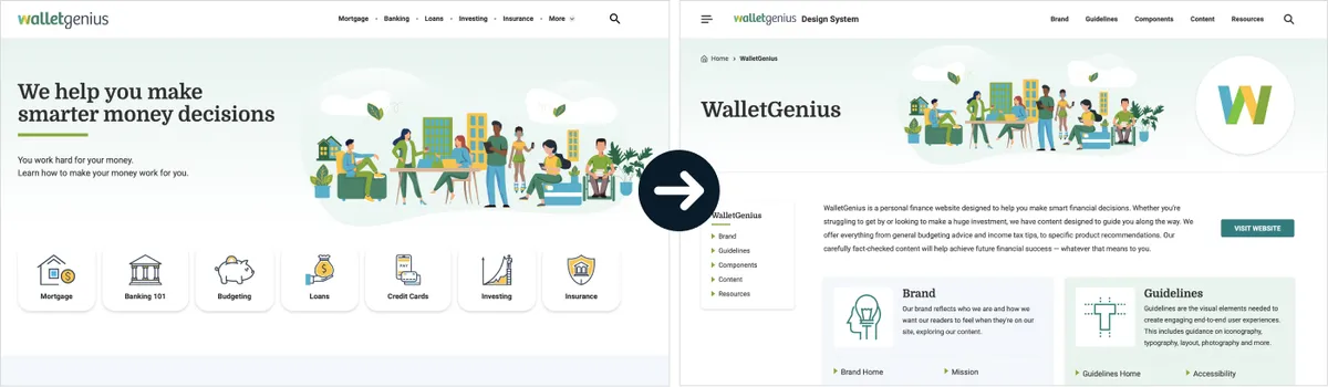
Each brand has the ability to tailor guidelines as they see fit. While some prefer highly detailed rules, others want more basic guidelines, like Waterfox.
I designed and developed the portal as a custom WordPress theme, prioritizing ease of editing so stakeholders across all 10+ brands could make updates easily. By housing interactive demos alongside copy-pasteable code snippets, I successfully bridged the gap between Figma mockups and front-end development across the entire organization.
Adoption & Impact
Driving Organizational Change
Building the system was only half the battle; driving adoption required constant advocacy. I conducted interactive training sessions and introduced the design portal to over 200 employees during a company-wide meeting.
It quickly became a cornerstone of our onboarding process. By providing a unified hub, new designers and engineers gained immediate access to the "System1 way of thinking," significantly reducing ramp-up time.
Measurable Outcomes
- Efficiency: Engineers utilized pre-built, documented components, bypassing structural headaches and reducing development time.
- Consistency: Designers leveraged shared templates to mock up high-fidelity screens for internal properties (Checkin, CarsGenius) with massive structural parity.
- Unification: By aligning disparate teams under one portal, we stabilized brand standards across 10+ applications without stripping independent properties of their unique identities.