
Business Context
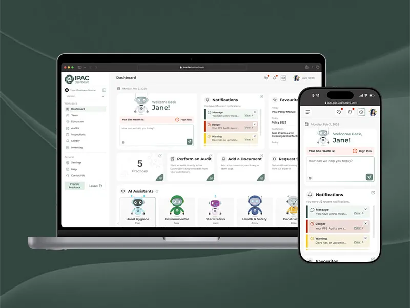
IPAC Consulting is a healthcare consulting company that helps long-term care homes, dental clinics, and other healthcare facilities meet infection prevention and control (IPAC) standards. When I joined as a UI/UX Designer in 2024, there was no design system in place and each surface looked and behaved differently.
I proposed a new initiative: build a unified design system to serve four main areas — the IPAC Dashboard (our B2B SaaS platform), the Dashboard marketing website, the IPAC Consulting website, and ongoing marketing and education materials. The goal was to raise the quality and consistency of our design work while making it easier and faster for engineering and marketing teams to ship.
Design & Tech Debt
Early on, several issues became clear:
- Our website and marketing assets lacked consistency in typography, colour, iconography, and spacing, which weakened the brand.
- The new IPAC Dashboard project needed UI foundations and clear guidelines while development was already underway.
- Design files were fragmented across Figma, with no shared library or structure to connect teams.

"The design system has been a huge help for my marketing projects. It keeps everything consistent and saves me time. The colors page, in particular, is the resource I use most often."
– Marketing Coordinator at IPAC Consulting
Process
-
Securing Buy-In
I introduced the concept of a design system to the broader team, walking through current inconsistencies and showing how a shared library could improve brand quality, accessibility, and development speed. Leadership quickly saw the value and asked me to lead design systems work alongside my product design responsibilities.
-
Design Audit
I conducted a comprehensive audit of our existing products to understand the scope of inconsistency. I catalogued every button variant, colour usage, typography choice, and spacing pattern across the corporate website and print materials. The audit revealed dozens of button styles, conflicting colour palettes, and inconsistent spacing — confirming that we needed a systematic approach, not just incremental fixes.
I prioritized components by how critical they were to the product and how out of sync they were with current designs. This helped me focus on the highest-impact components first.
-
Design Ops & File Governance
I restructured our Figma workspace so every product and campaign linked back to a single IPAC Design System library. Files were organized by product area and access level, and the team were given direct access to the system file for reference and spec.
-
Components & Tokens
I rebuilt core components for the website and dashboard — buttons, inputs, cards, navigation, layouts — using a shared set of design tokens. We adopted a 4px spacing grid, with tokens like
space-4mapping to 16px, and global colour tokens such asprimary-500for easier handoff and future theming.I structured tokens to be developer-friendly, using naming conventions that mapped clearly to CSS variables and class names. This made it easier for engineers to translate designs into code and reduced back-and-forth during handoff.
-
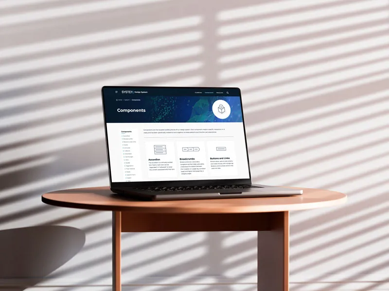
Documentation & Guidelines
Alongside the Figma library, I created a documentation website that explained how and when to use components, colour, and typography. This site was added to onboarding and Smartsheets so new team members could quickly learn the system.
-
Execution & Governance
I rolled the system into active projects in phases. Components were only introduced into product and marketing files once full-page replacements were possible, which helped avoid awkward hybrid states where old and new styles mixed.
Because I was the primary designer, I kept governance lightweight but intentional. I tracked required updates and issues through our bug-tracking tools (Smartsheet) and annotated Figma files with comments so developers knew exactly what needed to change. New component variations were documented, named, and reviewed against existing patterns before being added to the system, which kept the library focused and prevented component creep.

Challenges & Solutions
Building and scaling a design system comes with unique challenges. Here's how I addressed key obstacles while maintaining system integrity and team adoption.
Semantic Tokens for Theming
As the IPAC Dashboard evolved, I needed to support future themes
like dark mode. Relying only on raw color tokens made changes risky
and time-consuming. I introduced semantic tokens for key components
(like button-surface-primary instead of hard-coded hex values),
created a comprehensive token migration strategy, and established naming
conventions that made design intent clear to both designers and developers.
Cross-Team Adoption
The marketing team understood the concept of a design system but sometimes used off-system colors, fonts, or illustration styles, which weakened the brand. I worked with my manager and developers to add a Smartsheet-based review step, created marketing-specific component variants, developed targeted training sessions, and implemented a feedback loop where the marketing team could request new variants.
Scaling to New Products
When we launched new products that required different header, footer, and layout variants, I extended existing components rather than creating entirely new ones, created product-specific theme layers, and developed a framework for evaluating when to extend vs. create new components.
Measuring Impact
Leadership wanted to understand the ROI of the design system investment. I tracked key metrics like component reuse rate and development time reduction, created quarterly reports showing adoption rates, and established user feedback loops.
Design System Structure
I organized the IPAC Design System into three core pillars: Brand, Design Foundations, and Components. This structure creates a clear, efficient system tailored to the needs of our small team and the company.

Brand Foundation
The brand section establishes our core identity with clear vision, values, and principles. I created a comprehensive language guide that ensures consistent messaging across all products and marketing materials.
Design Foundations
This section contains all our core design elements including accessibility guidelines, color systems, icons, layout principles, logo usage, spacing and sizing scales, and typography. These foundations serve as the building blocks for all components.
Component Library
All components used across our products are centralized in this section, including alerts, buttons, cards, forms, tables, widgets, AI assistants, and icons. Each component is built using our design tokens and follows our established patterns.
Documentation & Implementation
I maintain the complete component library in Figma with all colors, typography, and component variations. The detailed documentation website provides comprehensive usage guidelines, implementation examples, and design decisions for each component and foundation element.


Unified Component Library
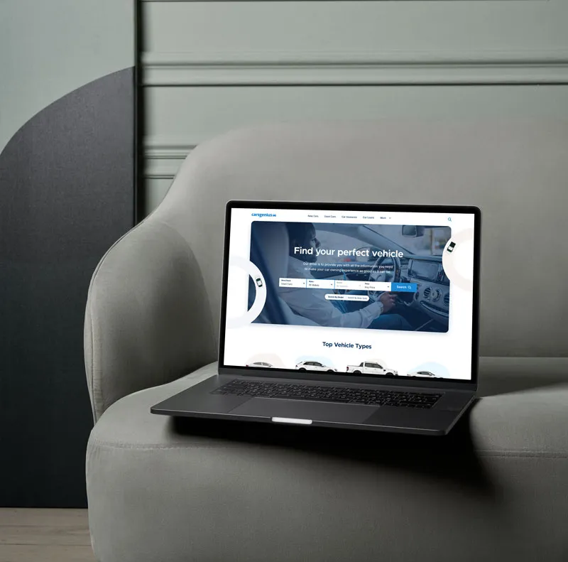
From September 2024 onward, the IPAC Design System became the foundation for our main products — the IPAC Dashboard (app and marketing website), the corporate website, and ongoing marketing and education materials. Shared components across these areas reduced one-off UI and made brand changes easier to roll out.

Core Components
Our library includes comprehensive components for all common UI needs: navigation (headers, footers, breadcrumbs, pagination), forms (inputs, selects, checkboxes, radio buttons, textareas), feedback (alerts, modals, tooltips, badges), content (cards, tables, lists, accordions, tabs), actions (buttons, dropdowns, menus), plus specialized components like widgets, AI assistants, and icons.


Design Tokens & Architecture
I created a comprehensive token system within Figma that serves as
the single source of truth for our design decisions. Most colors are
semantic, using names like primary-500, primary-400, neutral-900, accent-tan, alert-success, and alert-danger, with a few exceptions like --black and --white.
I also created component-specific tokens such as text-base, text-secondary, button-surface-primary, icon-button-surface-primary, and input-surface-base.
For spacing, I established a clear system where space-1 equals
4px, and sizing follows the same pattern with size-1 equaling
4px. Radius tokens map to spacing values (radius-sm = space-1, radius-default = space-2), and I have
specific tokens for icon strokes (stroke-icon-default = 1.5px).

Developer Integration
For smooth developer handoff, I ensured that developers use the same variable names as my token names. This direct mapping makes implementation straightforward and reduces translation errors. I've recently started integrating dark mode support, which works naturally with our existing token structure.

Design Benefits
This token-driven approach provides consistency across all products, makes theme support (like dark mode) straightforward, and ensures design decisions are systematic rather than arbitrary. The semantic naming makes the purpose of each token clear, while the direct developer mapping reduces implementation time and errors.
Accessibility by Design
Accessibility is foundational to the IPAC Design System. All components are validated against WCAG 2.1 AA standards, including color contrast, keyboard navigation, and screen reader compatibility.
I test using various contrast‑checking tools, screen‑reader software, and keyboard‑only navigation workflows. Interactive elements include proper focus indicators, semantic structure, and the necessary ARIA attributes.
Configurable Components
Our components use Figma's variant system to allow easy customization while maintaining system integrity. The alert component demonstrates this approach with its flexible configuration options.

The Alert component includes type variants for default, danger, and warning states. Designers can show or hide elements like user names, headings, dates, descriptions, icons, and close buttons. All components are fully responsive across all screen sizes.
Scalable Across All Viewports
All components in the IPAC Design System are built to work across all screen sizes. While I don’t enforce specific breakpoints, components follow standard responsive patterns and adapt naturally from mobile to desktop. Using Figma’s auto‑layout, components adjust based on their content and container.

"I'm obsessed with this design system. It makes it so much easier to keep everything on-brand."
– Front-End Engineer @ IPAC Consulting
Outcomes & Impact
The design system delivered immediate benefits across design and engineering, creating measurable improvements in efficiency, consistency, and collaboration.
Development & Process
- Faster design: Reusing system components when designing new screens has roughly cut my design time in half — what used to require building UI from scratch now takes minutes to assemble.
- More efficient handoff: Handoff required less explanation and back-and-forth between design and engineering.
- Better collaboration: The governance process created more opportunities for designers and engineers to work together early, catching issues before implementation.
- Shared guidelines: The design system documentation became part of onboarding and internal hubs, giving teammates a single source of truth for design decisions.
Brand & Product
- Increased consistency: The coded product now matches designs more closely, with fewer rogue components and visual inconsistencies.
- Website updates: We refreshed core components on the marketing and corporate site — starting with buttons, typography, and cards — which significantly improved visual consistency and readability.
- Dashboard designs: Every new dashboard feature now uses system components, reducing visual drift and enabling faster iteration on complex workflows.
- Marketing consistency: Campaigns and print materials use the same core palette, typography, and iconography as digital products, strengthening the overall brand.


"Thank you! I still need to tell you how much I use this. The system saves me so much time when I'm working on new materials."
– Marketing Coordinator at IPAC Consulting